Media Size L Specifications for Digital and Print Platforms
Learn media size L specs for digital and print, including pixel dimensions, aspect ratios, and platform-specific guidelines for optimal quality.

Understanding Media Size L Across Platforms
When working with digital and print media, media size L refers to a medium-large content format widely recognized across platforms. This standard balances high visibility with efficient performance and is especially relevant for social media image guidelines, video thumbnails, and print-ready projects. Understanding size L specifications helps ensure your assets look sharp and load quickly, whether on Facebook, Instagram, YouTube, or in printed materials.
In most contexts, size L lies between the medium (M) and extra-large (XL) categories:
- Digital media: Offers crisp display quality without exceeding optimal load times.
- Print media: Delivers large, professional-looking visuals while remaining within standard sheet or poster dimensions.
---
Common Technical Specifications for Size L
The technical standards for "media size L" vary by use case, but these guidelines represent typical values.
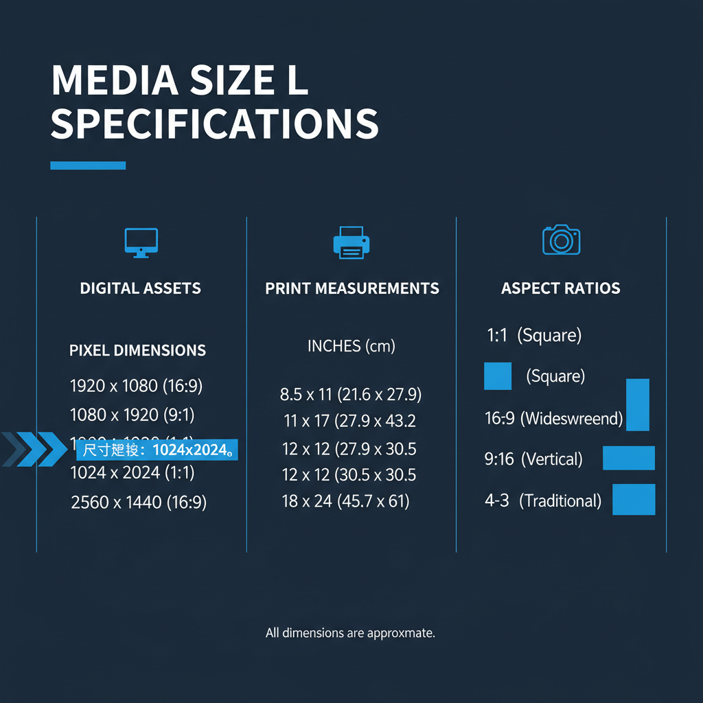
Pixels for Digital Assets
Common L size pixel dimensions include:
- 1200 × 800 px — versatile for web banners and blog post images.
- 1080 × 1080 px — square format popular on Instagram feeds.
- 1280 × 720 px — standard 16:9 ratio for video thumbnails.
Inches for Print Outputs
Standard print interpretations of size L:
- 8 × 10 inches — classic photo print size.
- A4 dimensions — 8.27 × 11.69 inches for documents.
- 11 × 17 inches — larger posters, still manageable for standard commercial printing.
Aspect Ratios
Typical ratios include:
- 4:3 — photography, presentation slides.
- 16:9 — widescreen video and banners.
- 1:1 — social media profile posts.
---
Size L in Popular Platforms
Designing for major platforms requires adapting size L dimensions to their native specifications.
| Platform | Size L (Pixels) | Aspect Ratio | Usage |
|---|---|---|---|
| 1200 × 630 | ~1.91:1 | Shared link preview image | |
| 1080 × 1080 | 1:1 | Main feed post | |
| YouTube | 1280 × 720 | 16:9 | Video thumbnail |
| Standard Website | 1024 × 768 | 4:3 | Content images |
---
Benefits of Using Size L
Choosing size L offers key advantages:
- Balanced quality & performance — detailed visuals without excessive file sizes.
- Multi-platform compatibility — fits common requirements for online and offline media.
- Professional presentation — sharp display suitable for campaigns and portfolios.
- Responsive readiness — integrates smoothly into adaptive web layouts.
---
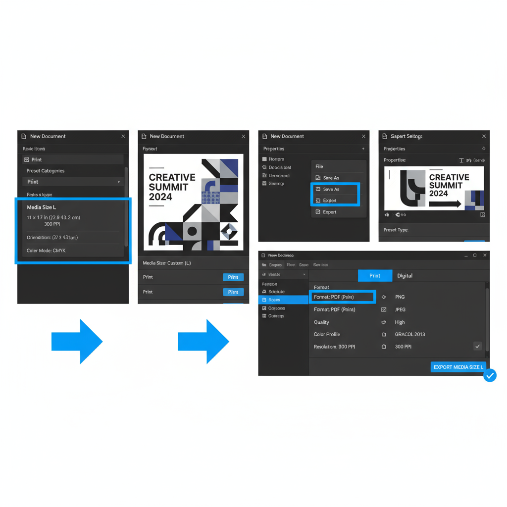
Preparing and Exporting Media Size L in Design Tools
Graphic design tools streamline the creation process for size L assets.
Photoshop Workflow
- Set canvas size: `File > New` → enter pixel dimensions (e.g., 1200 × 800 px).
- Design in native resolution: Avoid upscaling low-quality images.
- Export settings:
- Name smartly: e.g., `banner_size_L.jpg`.
    File > Export > Save for Web (Legacy)
    Quality: 80 JPEG
    Size: As specified (no resample)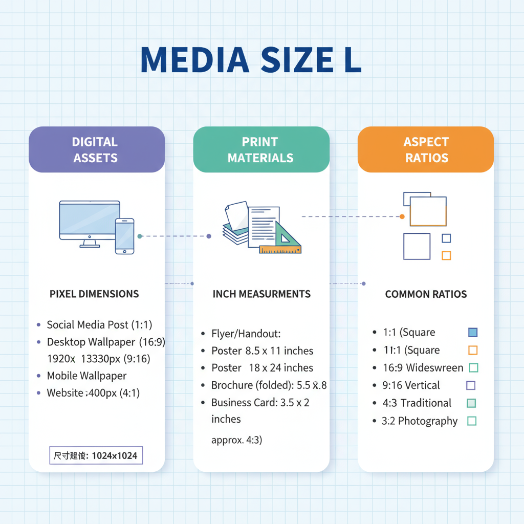
Canva Workflow
- Select a template near desired pixel specs.
- Use Custom Dimensions for exact sizing.
- Export in PNG for transparency or JPEG for compressed uses.
---
Optimizing Size L for Responsive Web Design
To ensure performance and adaptability:
- Use HTML `srcset`:

---
Printing Considerations for Size L
Accuracy in print demands attention to resolution, bleed, and color management.
DPI Standards
Aim for 300 DPI for crisp output:
- Pixels = Inches × DPI
8 × 10 inches → 2400 × 3000 px.
Bleed and Safe Zones
- Add 0.125 inches bleed per side.
- Keep critical content within safe zone to avoid trimming.
Color Profiles
- Use CMYK workflows for print.
- Convert from RGB before final export.
---
Accessibility and UX Impact
Size L supports inclusive design:
- Legible text — higher resolution avoids pixelation.
- Scalable UI components — maintain proportions across devices.
- Informative alt text — aids screen readers.
---
Troubleshooting Common Issues
Avoid pitfalls with these solutions:
Blurriness
- Export at native or larger resolution.
Cropping Errors
- Match platform aspect ratios accurately.
Scaling Distortion
- Constrain proportions while resizing.
---
Best Practices Checklist
Ensure consistency with this checklist:
- Validate platform specs.
- Design at native resolution.
- Apply correct compression.
- Test on multiple devices.
- Add descriptive alt attributes.
- Organize file naming (`project_sizeL_v1.jpg`).
- Backup original files.
---
Summary
Mastering media size L ensures your images and videos are optimized for both digital and print. By adhering to platform-specific dimensions, DPI requirements, and responsive design principles, you can create assets that look professional, load efficiently, and remain accessible. Ready to take your visuals to the next level? Start refining your size L strategy today for better brand impact across platforms.
![Why Luck Matters More Than Talent for Success in Life | [Jingwei Insight]](/content/images/size/w600/2025/10/img_001-103.jpg)