Px Size Explained for Web Design and Digital Graphics
Learn how px size impacts web design, screen resolution, and pixel density, with tips for responsive layouts, sharp graphics, and accessible typography.
Understanding Px Size in Web Design and Digital Graphics
In modern web design and digital graphics, understanding px size—short for pixel size—is crucial for crafting layouts that look sharp and scale correctly across devices. A pixel is the smallest controllable element in a raster image or display, and px units define dimensions based on these points of color. This guide explains what px size means, how it relates to screen resolution and density, and how to use it effectively for responsive, accessible, and visually appealing design.

---
What Does Px (Pixel) Size Mean?
A pixel is a single point in a digital image or on a display device. The px size describes the number of pixels used along a dimension, such as width or height.
Examples:
- An image with a width of 400px is 400 pixels wide.
- A block element styled in CSS as `width: 300px` will occupy 300 device pixels horizontally.
Pixels are measured in digital units. Their actual physical size varies across devices depending on display density.
---
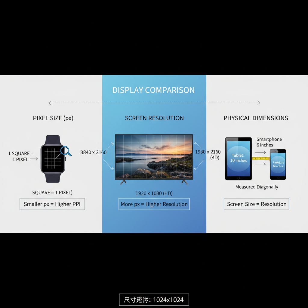
Px Size and Screen Resolution
Screen resolution is the total count of pixels across a display’s width and height, e.g., 1920×1080.
Relation to px size:
- An image at 400px wide occupies ~20% of a 1920px-wide screen.
- The same image takes ~37% of a 1080px-wide laptop display.
Because px proportions vary by resolution, responsive design ensures visuals look consistent across all screens.
---
Px Size vs Physical Dimensions
Pixels are not fixed in physical size. Pixel density determines physical dimensions.
Example:
- A 1920px-wide 24-inch monitor vs. a 1920px-wide 15-inch laptop: pixel count is identical, but each pixel is physically smaller on the laptop.
Key difference:
- Px size: Digital measurement unit.
- Physical dimensions: Measured in inches, cm, or mm.
---
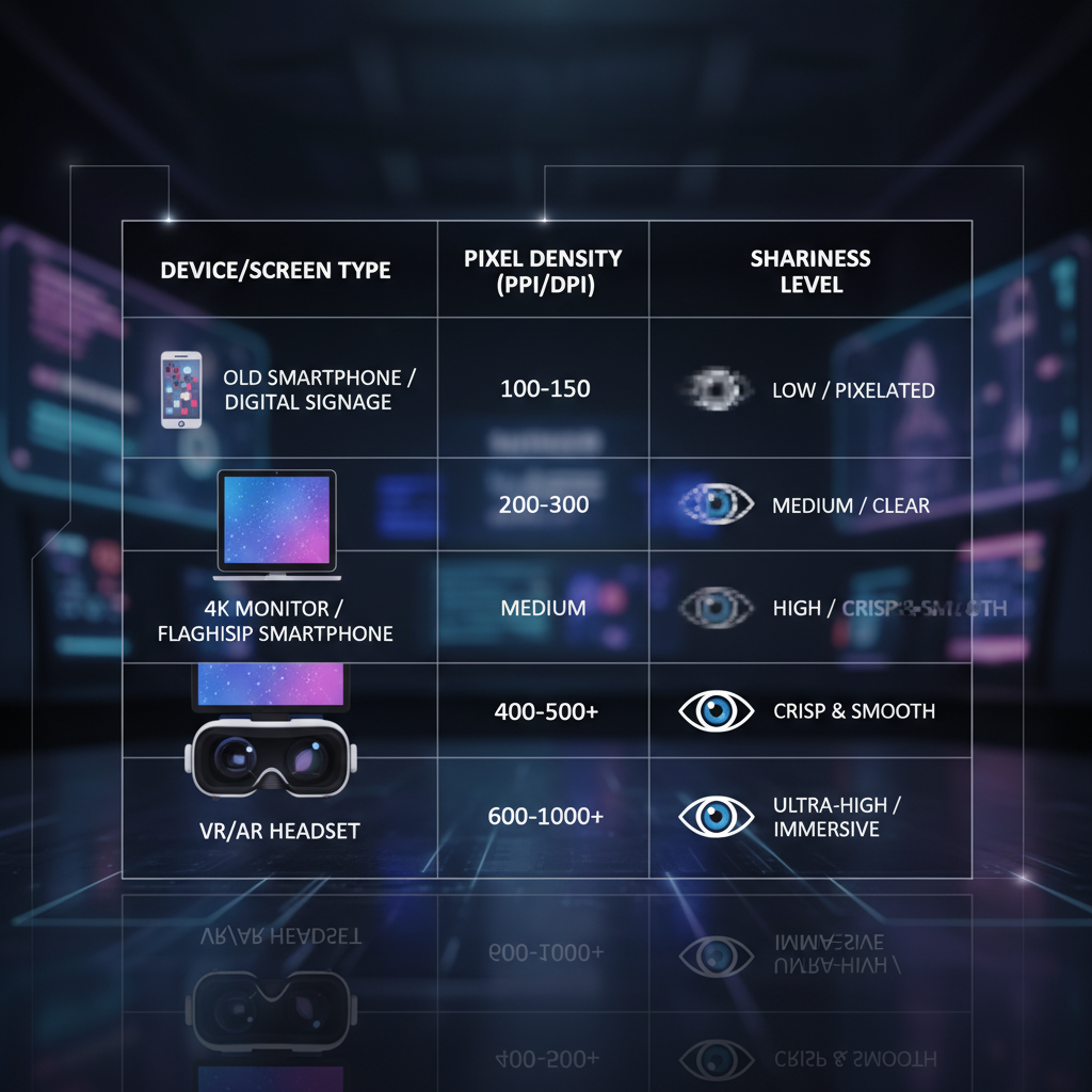
Pixel Density (PPI/DPI) and Sharpness
Pixel density strongly influences sharpness.
- PPI (Pixels Per Inch): Pixels per inch on a display.
- DPI (Dots Per Inch): Used in printing; similar concept.
Higher PPI benefits:
- Smaller pixels.
- Better sharpness.
- Smoother text and images.
Example Pixel Density Table
| Device | Resolution | Screen Size | PPI |
|---|---|---|---|
| iPhone 14 | 2532×1170 | 6.1" | 460 |
| MacBook Pro 14" | 3024×1964 | 14" | 254 |
| 24" Desktop Monitor | 1920×1080 | 24" | 92 |
---
Px Size in Responsive Web Design
In responsive web design, px sizes should scale with screen size and density. Using fixed px values without adjustment can result in:
- Tiny text or elements on high-density screens.
- Oversized components on smaller displays.
Strategies:
- Adopt relative units (`em`, `rem`, `%`) for flexible sizing.
- Apply `max-width` and `min-width` in media queries to adapt px dimensions.
---
Choosing Optimal Px Sizes for Images and UI Elements
Guidelines:
- Buttons: Minimum 44px height for touch devices.
- Icons: Use SVG/vector or larger variants for high-density screens.
- Images: Provide multiple resolutions with `srcset`.
---
Px Size Considerations for Typography
Fixed px font sizes can impair accessibility.
Best Practices:
- Use relative units for body text.
- Reserve px values for headings where precise control is needed.
- Ensure base font size is at least 16px.
---
Differences Across Devices: Desktop, Mobile, Retina
Device pixel ratio impacts how px sizes render:
- Non-retina desktop: 1 CSS px ≈ 1 physical pixel.
- Retina/high-DPI: 1 CSS px spans multiple physical pixels.
- Mobile: Small screens often have high PPI; adjust px for touch targets.
Example:
- CSS button at 44px high looks the same height in CSS terms across devices but is physically sharper on retina screens.
---
Measuring and Adjusting Px Size in CSS
Direct px sizing in CSS offers control:
.button {
  width: 120px;
  height: 44px;
  font-size: 16px;
}
Adjustment Techniques:
- Mix px and relative units.
- Use media queries to tailor sizes per screen width.
@media (max-width: 600px) {
  .button {
    width: 100px;
    font-size: 14px;
  }
}
---
Tools and Techniques to Test Px Size and Resolution Compatibility
Recommended Tools:
- Browser DevTools: View and test computed px sizes.
- Responsive Viewports: Simulate devices in DevTools.
- Online PPI calculators: Evaluate pixel density.
- Design apps: Figma, Photoshop for precise px control.
---
Common Mistakes in Px Size Settings
- Hardcoding px for all screens.
- Ignoring pixel density, causing blurry visuals.
- Small touch targets on mobile.
- No alternative image resolutions for high-DPI devices.
---
Summary & CTA
Key Takeaways:
- Px size is a digital dimension unit independent of real-world measurements.
- Screen resolution and PPI affect perceived size and sharpness.
- Responsive design demands adaptable px settings.
- Relative units enhance accessibility.
- Test designs across devices to ensure optimal display quality.
Master px size and resolution principles to deliver designs that look crisp and function perfectly everywhere. Need help optimizing your web layout or images for all screens? Start reviewing your px size strategy today and bring your designs to the next level.