Web Size Pixels Guide for Better Website Design
Learn how to choose optimal web image pixel dimensions, ensure responsive design, and optimize visuals for clarity, speed, and SEO performance.
Web Size Pixels Guide for Better Website Design
Pixel dimensions are a critical foundation of modern web design. They dictate how crisp, clear, and properly scaled your images appear across devices. Having a solid grasp of web size pixels enables you to create visually appealing pages that load quickly and function well on desktop, tablet, and mobile screens — boosting both user satisfaction and SEO performance.
In this guide, we’ll explain what pixels are, how they differ from resolution, outline standard image sizes for the web, and share optimization tips to make sure your visuals look great without slowing down your site.
---
Understanding Pixels in Digital Imagery
A pixel (short for “picture element”) is the smallest unit of a digital image. Each pixel holds a specific color, and combining millions of them gives you the complete picture on screen.
An image’s total pixel count — written as width × height (e.g., 1920×1080) — defines its dimensions. This figure directly impacts clarity, file size, and suitability for various display contexts.
Why Pixels Matter
- Sharpness: More pixels often mean more visible detail.
- File Size: Larger pixel dimensions produce heavier files.
- Scalability: Pixel dimensions determine how well an image scales across devices.
---
Screen Resolution vs. Image Dimensions
Despite being related, these concepts are distinct:
- Screen Resolution: The pixel count of a display device (e.g., 1366×768 for a laptop).
- Image Dimensions: The actual width and height of the image file in pixels.
Example:
An image of 800×600 pixels can fill most of a small-resolution display but may appear small on a high-resolution monitor.
---
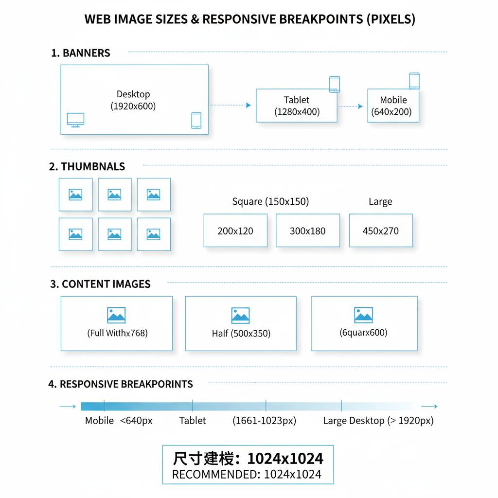
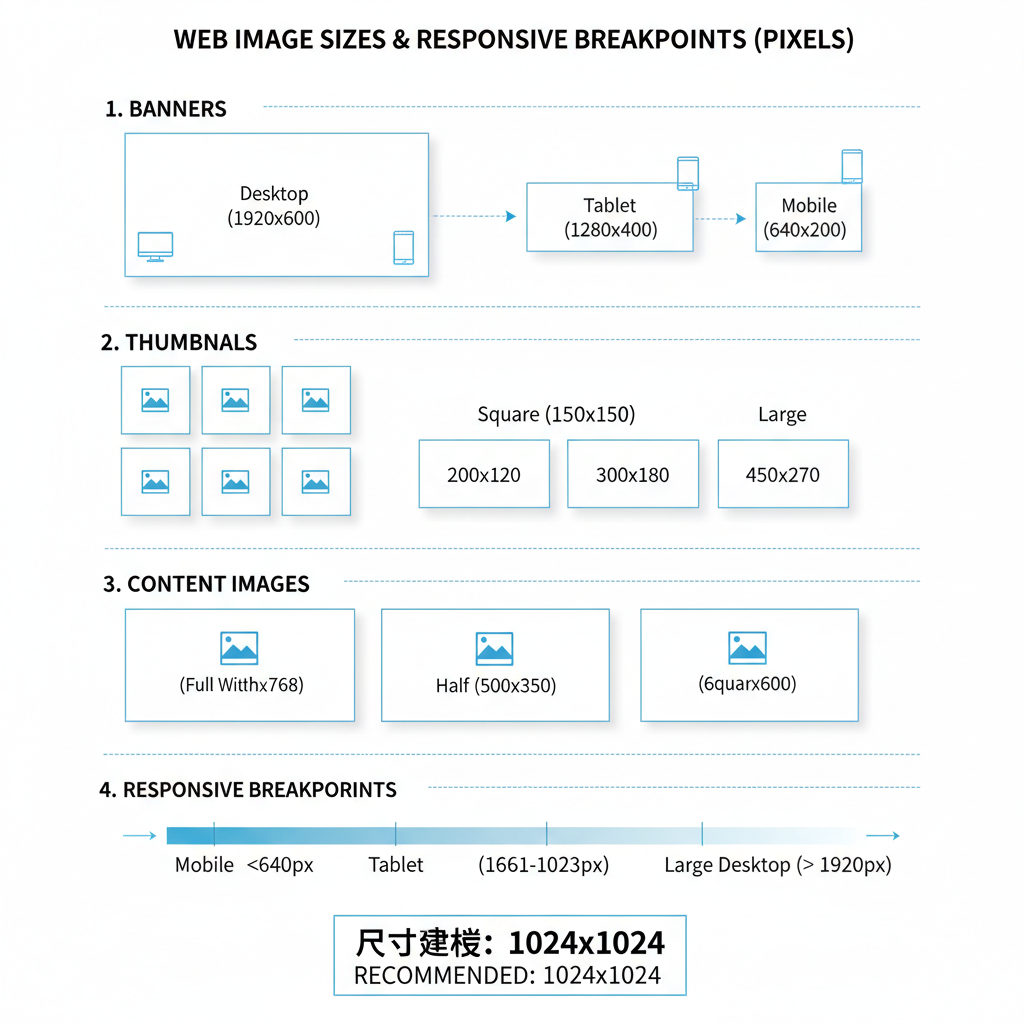
Standard Web Image Sizes in Pixels
For consistent layouts and professional appearance, follow common web image size ranges.
| Image Type | Common Pixel Dimensions | Usage |
|---|---|---|
| Header | 1920×400 | Spanning the top of the page |
| Hero | 1920×1080 | Main visual block above the fold |
| Thumbnail | 150×150 | Small preview images |
| Banner | 1200×628 | Advertising or promotional visuals |
| Content Image | 800×600 | In-article visuals |
> These are general guidelines; adjust sizes for your layout, design style, and responsive needs.
---
Importance of Responsive Design
Responsive design ensures images adapt seamlessly to varied screen sizes. Designing solely for desktop risks oversized graphics on mobile, slowing load times and harming usability.
Key strategies:
- Use `max-width: 100%` in CSS to prevent overflow.
- Implement `srcset` to serve scaled images for different resolutions.
- Test on multiple real devices to identify scaling issues.
---
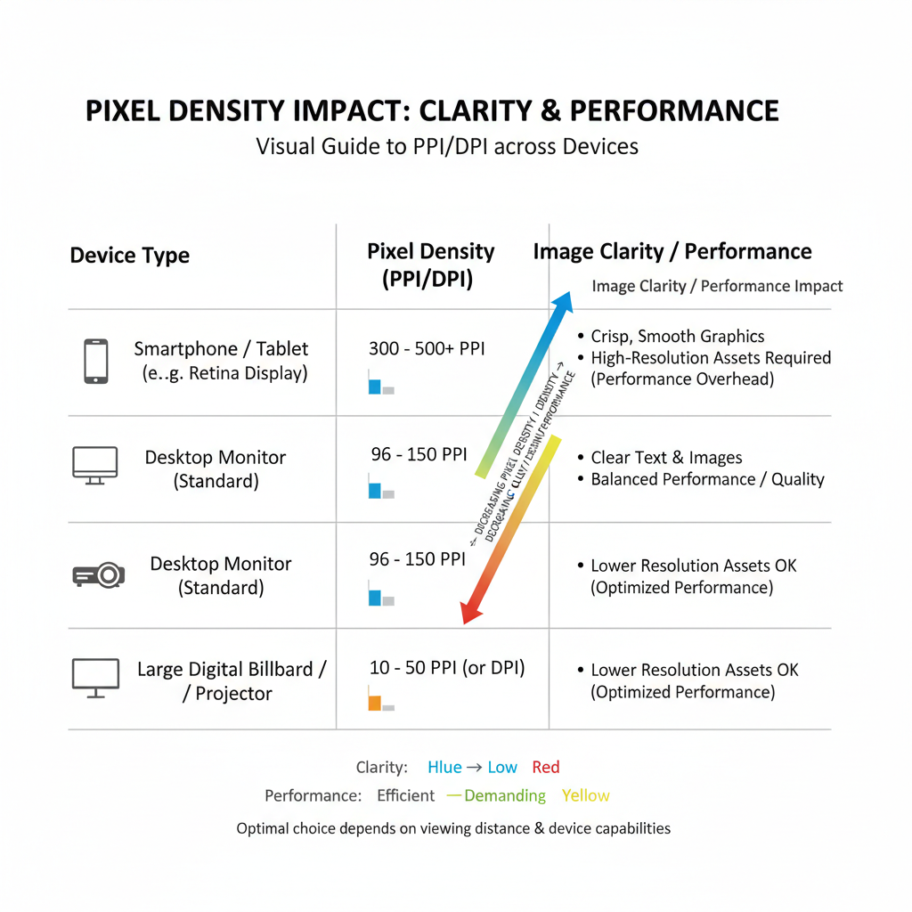
The Role of Pixel Density (PPI/DPI)
Pixel density measures how tightly pixels are packed.
- PPI: Pixels per inch, relevant to screens and sharpness.
- DPI: Dots per inch, mainly for print but sometimes used interchangeably.
High-density displays (e.g., Retina) need images with more pixels to maintain clarity. A 100px icon may look fine on standard screens but will appear blurry on Retina unless supplied at 200px and scaled down in CSS.
---
Choosing Pixel Dimensions for Performance
More pixels mean larger file sizes and slower load times, especially on mobile networks.
Best practices:
- Match images to their maximum display dimensions.
- Avoid uploading massive originals; scale before publishing.
- Favor lightweight, resolution-independent formats like SVG when possible.
---
Compression Techniques Without Losing Clarity
Compression minimizes file size while keeping quality acceptable.
- Lossy: Shrinks files by discarding some data (e.g., JPEG), with tunable quality.
- Lossless: Retains all data (e.g., PNG), usually larger than lossy formats.
Tips:
- For photos: JPEG at 70–85% quality.
- For transparent graphics: PNG or WebP.
- Test multiple tools and settings for optimal balance.
---
Tools for Resizing and Optimizing Images
Popular tools for handling web size pixels include:
- Adobe Photoshop: Precision control over dimensions and quality.
- GIMP: Free, open-source editor for resizing and optimization.
- TinyPNG / TinyJPG: Simple web compressors for PNG and JPEG.
- Squoosh: Google’s versatile image optimization app.
- ImageMagick: Command-line bulk processing of large sets.
---
Common Mistakes in Pixel Sizing
Avoid these pitfalls:
- Over-sizing: Uploading images far larger than their container.
- Under-sizing: Low-res images blown up, causing pixelation.
- Ignoring Aspect Ratios: Distorting images by stretching.
- Skipping Lazy Loading: Loading all images upfront instead of deferring off-screen ones.
> Always preview assets at actual display size.
---
Testing Across Devices
Thorough testing safeguards consistency and performance.
Steps:
- Open your site on desktop, tablet, and multiple mobile devices.
- Check load speed and image clarity for each.
- Use developer tools to simulate responsive display scenarios.
---
Accessibility Considerations
Images should comply with accessibility standards:
- Alt Text: Clear, descriptive text for screen readers.
- Contrast: Ensure text overlays remain readable for visually impaired users.
- Scalability: Allow zooming without breaking layouts.
Following WCAG guidelines improves inclusivity and user experience.
---
Summary
A smart approach to web size pixels blends design precision with performance optimization. By choosing the right dimensions, applying responsive techniques, considering pixel density, and compressing effectively, you’ll deliver visuals that impress users and search engines alike.
Start implementing these practices today to create faster, sharper, and more accessible websites — and watch your engagement and rankings improve.