Website Dimensions in Pixels for Modern Responsive Design
Learn the optimal website dimensions in pixels, breakpoints, and image sizes for responsive design across desktops, tablets, and mobile devices.
Introduction to Website Dimensions in Modern Web Design
When building a modern website, website dimensions in pixels play an essential role in user experience, accessibility, and design consistency. The term refers to the width and height of web elements—pages, images, and components—as rendered on-screen. With audiences consuming content across desktops, tablets, and mobile devices, understanding and applying the right dimensions is no longer optional; it’s fundamental to responsive design.
A thoughtful approach to dimensions ensures that your site looks sharp, loads efficiently, and adapts smoothly to various screen sizes without breaking layouts or cutting off content. In this guide, we’ll explain the most common pixel measurements, how to set breakpoints, and the best practices for different devices.
---
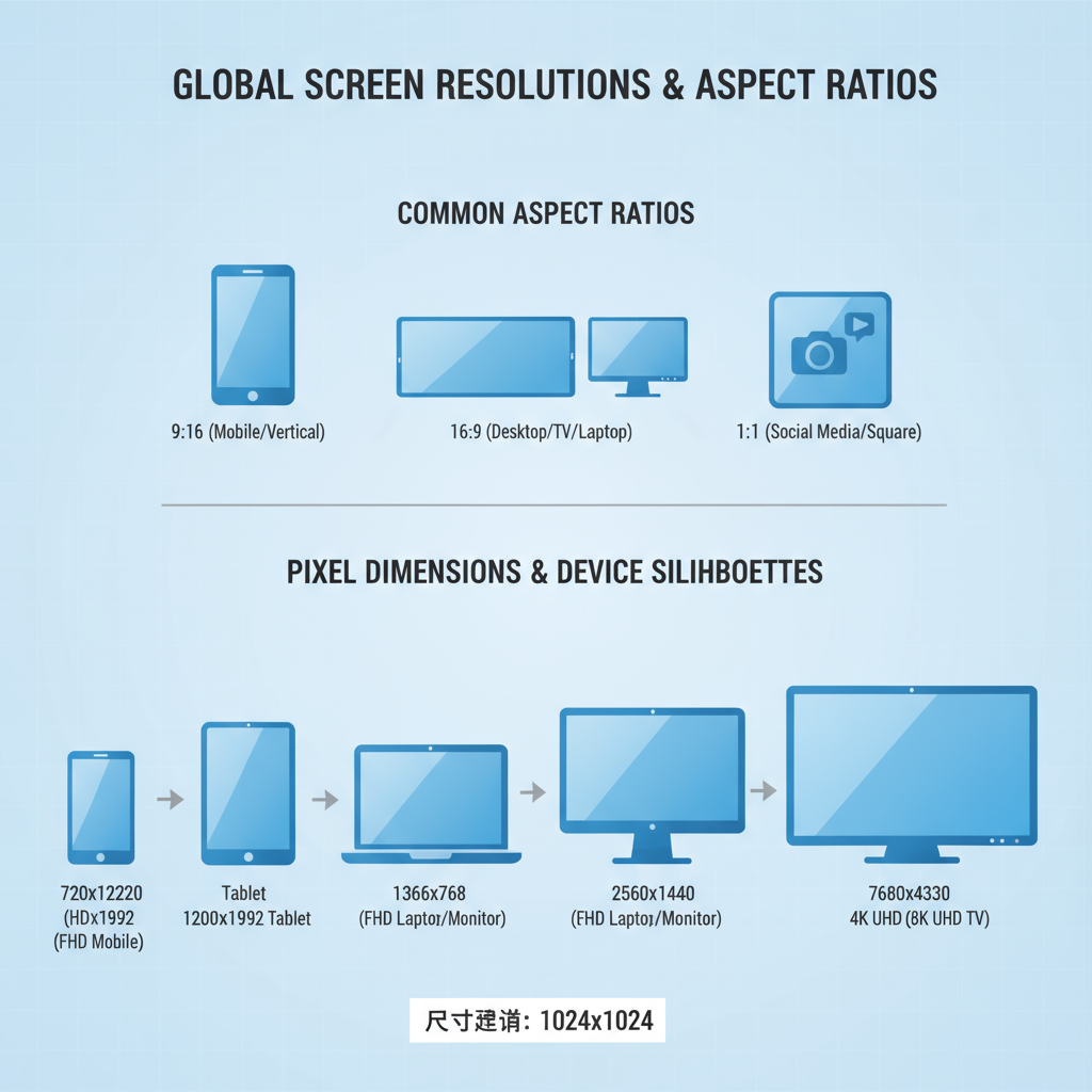
Common Screen Resolutions and Aspect Ratios
Today’s digital landscape is diverse, spanning 4K monitors, ultrawide setups, compact tablets, and small mobile phones. Designers must consider common screen resolutions and aspect ratios when planning breakpoints and image sizes.
Popular Resolutions
Some of the most widely used device resolutions include:
| Device Type | Resolution (px) | Aspect Ratio |
|---|---|---|
| Desktop (HD) | 1920 × 1080 | 16:9 |
| Desktop (WQHD) | 2560 × 1440 | 16:9 |
| MacBook Pro 14" | 3024 × 1964 | ~15:10 |
| Tablet | 1280 × 800 | 16:10 |
| Mobile (iPhone 14) | 1170 × 2532 | ~19.5:9 |
By noting these baseline resolutions, you can determine optimal widths for layout containers, images, and typography, ensuring your design fits the most common viewing environments.
---
Standard Website Width in Pixels for Desktop Layouts
Traditionally, websites were designed for screens around 1024 pixels wide. Modern trends lean towards container widths between 1200px–1440px for large displays while allowing fluid margins for smaller widths.
A common practice is to set a `max-width` for your main content container. For example:
.container {
  max-width: 1200px;
  margin: 0 auto;
}
This ensures the website content doesn’t stretch excessively on ultrawide monitors, preserving readability and visual balance.
---
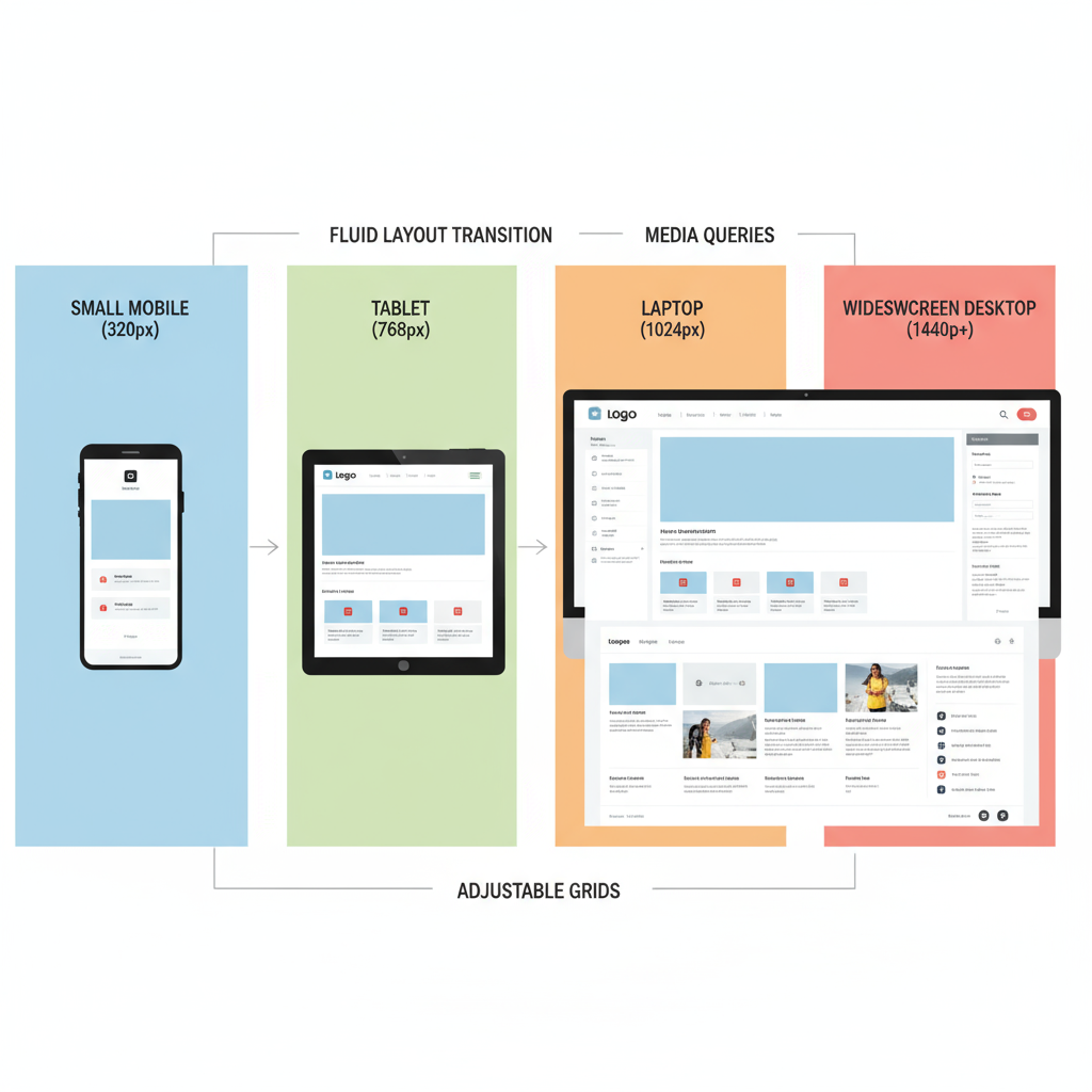
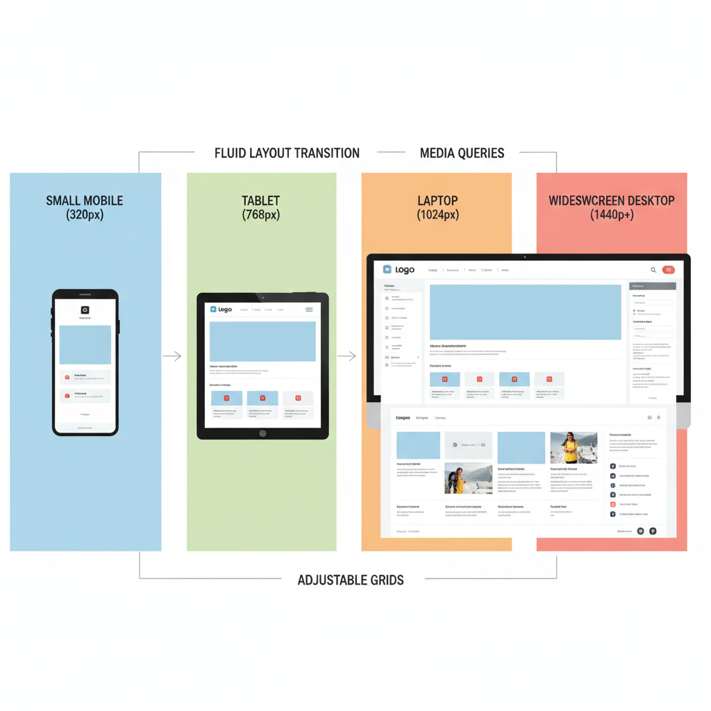
Optimal Dimensions for Responsive Design Breakpoints
Responsive design relies on breakpoints—specific pixel widths where the layout adapts to different device sizes. The most common breakpoints include:
| Device Category | Breakpoint (px) |
|---|---|
| Large Desktop | ≥ 1440px |
| Standard Desktop | ≥ 1200px |
| Tablet Landscape | ≥ 992px |
| Tablet Portrait | ≥ 768px |
| Mobile | < 576px |
By defining these breakpoints in CSS media queries, you can tailor layouts for each device category:
@media (max-width: 768px) {
  /* Tablet portrait and smaller: adjust layout */
}
---
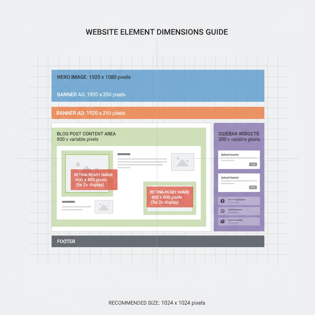
Hero Image, Banner, and Feature Section Dimensions
The hero section—the large, often full-width area at the top—sets the tone for your site.
Key recommendations:
- Hero Images: 1920px width × 800–1080px height for desktops.
- Banners: 1920px × 300–600px for promotional graphics.
- Feature Sections: Maintain visual consistency with the hero image style, but generally smaller in height (400–600px).
Always optimize large images through compression and modern formats like WebP to balance high resolution with fast load times.
---
Recommended Blog Post Image Sizes and Content Area Widths
For comfortable reading, the content width for blog articles often sits between 640–800px. This width allows optimal line lengths to reduce eye strain.
Image guidelines for blog posts:
- Inline Images: Up to 800px wide for desktop screens.
- Full-width Images: Match the main container width (e.g., 1200px).
- Thumbnails/Featured Images: 1200 × 628px (optimized for social sharing previews).
Striking a balance between resolution and file size will prevent slow-loading pages and keep visual clarity intact.
---
Designing for Retina and High-DPI Displays
High-DPI (Retina) screens pack more pixels into the same physical space, meaning standard-resolution images may appear blurred. To maintain crispness:
- Export images at 2× the intended display size (e.g., a 600px display width uses a 1200px image file).
- Use `srcset` for delivering responsive images:
- Utilize SVGs for logos and icons to ensure scalability without quality loss.
---
How to Test Website Dimensions Across Devices and Browsers
Testing ensures that your chosen website dimensions in pixels display correctly on real-world devices.
Testing methods:
- Browser DevTools: Simulate different device viewports quickly.
- Physical Devices: See how your site appears on various monitors, tablets, and phones.
- Responsive Testing Tools: Services that preview multiple screen sizes side-by-side.
During testing, check for:
- Layout issues at breakpoints.
- Blurry assets on high-DPI screens.
- Overflow or excessive white space on small devices.
---
Tools for Measuring and Previewing Dimensions in Pixels
A variety of tools can help you work accurately with pixel dimensions:
- Figma, Sketch, Adobe XD: Create pixel-perfect prototypes.
- Chrome DevTools & Firefox Developer Tools: Inspect element sizes live in the browser.
- Responsive Design Mode: Emulate multiple dimensions without extra hardware.
- Online Image Resizers: Adjust and preview image dimensions using web-based tools.
These make design workflows more efficient and implementation more precise.
---
Common Mistakes to Avoid with Fixed vs. Fluid Layouts
One of the most frequent mistakes is using a fixed-width layout that ignores variations in screen size. This can cause:
- Cropped elements on narrow screens.
- Excessive margins and spacing on large displays.
Instead, adopt fluid layouts using percentage widths, `max-width`, and flexible CSS grid or flexbox systems. Another costly oversight is skipping high-DPI optimization, which leads to pixelated visuals on modern devices.
---
Conclusion and Best Practices Summary for Pixel-Perfect Design
Mastering website dimensions in pixels requires balancing content clarity, load performance, and adaptability.
Best practices:
- Base layouts on tested breakpoints and container widths (e.g., ~1200px for desktops).
- Test thoroughly across devices and environments.
- Serve optimized images with high-DPI support where needed.
- Build with flexible grids, not fixed layouts.
- Keep content widths user-friendly (640–800px for articles).
By following these guidelines, you'll create responsive, accessible, and visually appealing websites that deliver consistent quality across today's diverse device landscape. Start auditing your site’s dimensions today to ensure a truly optimized user experience.