Best Website Image Sizes for Speed, SEO, and Performance
Learn the best website image sizes, formats, and compression techniques to boost site speed, improve SEO, and enhance user experience.
Best Website Image Sizes for Speed, SEO, and Performance
Creating a fast-loading, visually appealing site requires proper website image sizes for optimal performance, SEO, and user experience. Oversized or unoptimized images can slow down your site, hurt Core Web Vitals, and reduce engagement. This comprehensive guide explains why sizing matters, offers ideal dimensions for common use cases, and provides actionable optimization tips.
---
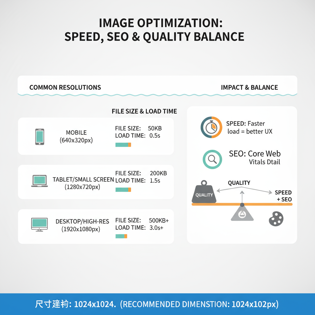
Why Website Image Sizes Matter for Speed, SEO, and UX
Images often comprise the bulk of a web page’s total weight. Oversized or unoptimized images:
- Increase page load times
- Worsen Core Web Vitals scores
- Indirectly hurt Google rankings via slow speeds
- Frustrate users on slow networks or mobile devices
When you serve appropriately sized and compressed images, pages load faster, visual appeal is maintained, and conversions improve due to smoother engagement.
---
Understanding Image Dimensions vs. File Size
Image dimensions measure width × height in pixels (e.g., 1200 × 800 px).
File size is measured in KB or MB.
They are related but not equivalent. For example, a small-dimension image saved in an inefficient format might still have a large file size. Conversely, a high-resolution image might be compressed to a lighter file weight.
---
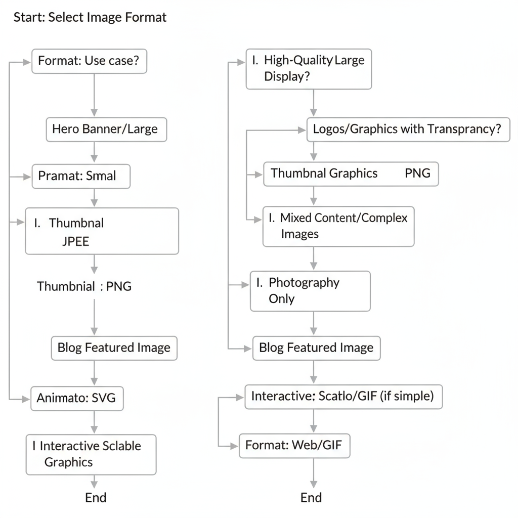
Common Image File Formats and When to Use Each
Choosing the right format influences quality, transparency support, and compression.
| Format | Best For | Pros | Cons |
|---|---|---|---|
| JPEG | Photographs, complex images | Small file size, widely supported | Lossy compression may reduce quality |
| PNG | Transparent graphics, logos | Lossless, high quality, supports transparency | Larger file sizes than JPEG |
| WebP | Most images, modern browsers | Smaller files, supports transparency and animation | Not supported on some older browsers |
| SVG | Line art, icons, logos | Scalable without quality loss, tiny file size | Not ideal for complex photography |
---
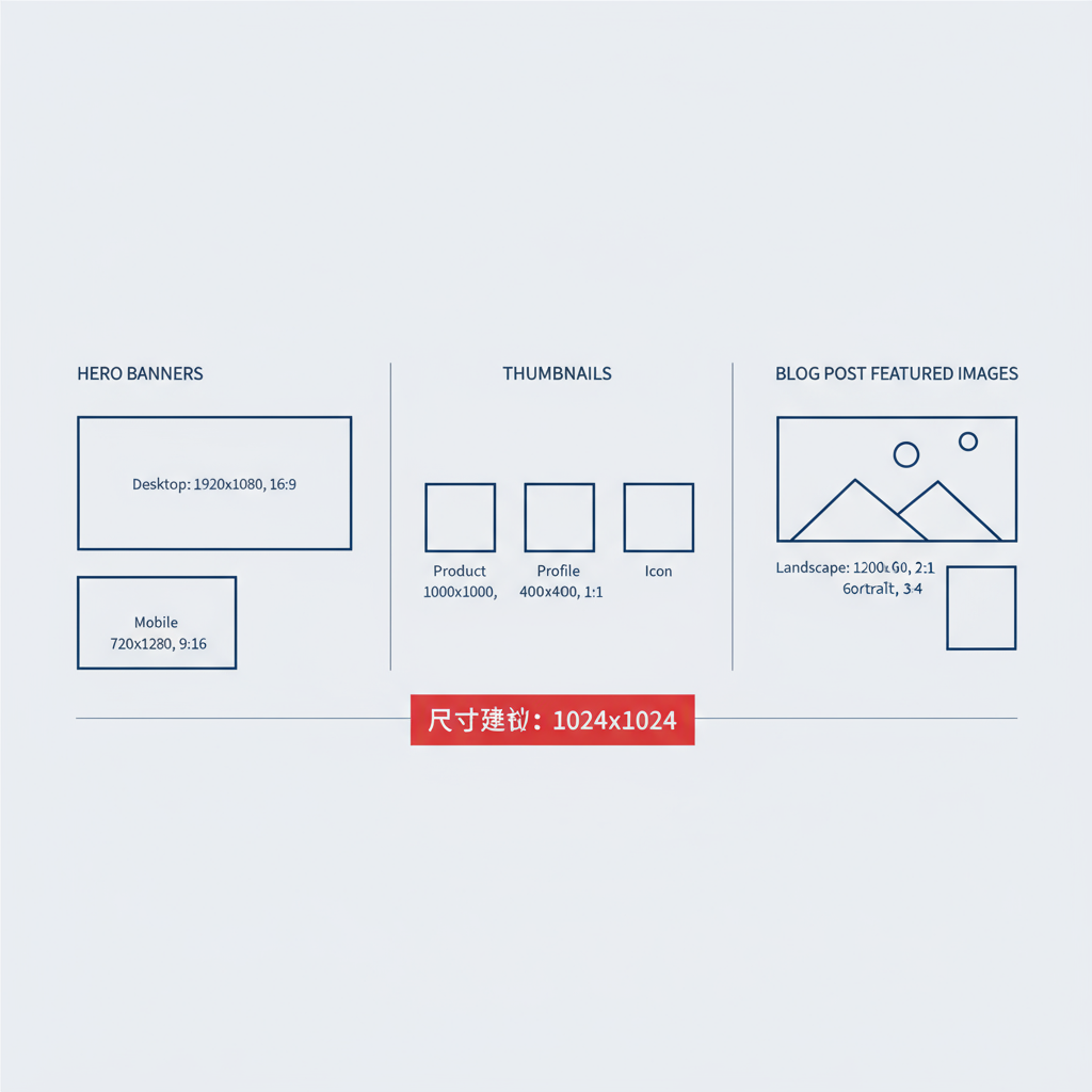
Ideal Image Sizes for Different Use Cases
The optimal image size depends on layout and function.
Hero Banners
- Full width: 1920 × 1080 px
- Retina display: up to 2560 px width
- Target file size under 500 KB
Thumbnails
- 150 × 150 px to 300 × 300 px
- File size under 50 KB
Blog Post Featured Images
- 1200 × 630 px (works for Open Graph social sharing)
- Compress to ~150 KB or less
Product Images (eCommerce)
- Standard: 800 × 800 px or 1024 × 1024 px
- Zoomable: up to 2048 px width
- WebP format recommended
Social Media Previews (Open Graph)
- Facebook/LinkedIn: 1200 × 630 px
- Twitter (X) large card: 1200 × 675 px
---
How to Choose the Right Pixel Dimensions for Your Layout
- Identify the maximum display size in the layout (e.g., CSS container width).
- Export images at 1× or 2× container width to support retina.
- Avoid uploading beyond the necessary resolution.
---
Best Practices for Compressing Images Without Losing Quality
- For photographs: lossy compression (JPEG/WebP).
- For logos/graphics: lossless compression (PNG/SVG).
- Use 60–80% quality for JPEG to balance clarity with size.
- Retain metadata only when essential.
---
Responsive Images and HTML Attributes
Use HTML attributes for device-appropriate image sizes:
- `srcset`: defines variations in size.
- `sizes`: instructs which version to use per viewport.
---
Using Lazy Loading for Below-the-Fold Images
Lazy loading delays non-visible images:
- Improves perceived load speed
- Reduces data use for users who do not scroll far
---
Tools for Resizing and Optimizing Images
- Online: TinyPNG, Squoosh, ImageOptim Web
- Desktop: Photoshop “Save for Web”, GIMP, Affinity Photo
- Automation: gulp-imagemin, webpack image-loader
---
Case Study: Before & After Speed Gains
A mid-sized eCommerce store optimized website image sizes:
Before:
- Page weight: 5 MB
- Load time: 5.6 seconds (4G)
- Largest Contentful Paint (LCP): 4.2 seconds
After:
- Page weight: 2.1 MB
- Load time: 2.3 seconds (4G)
- LCP: 1.9 seconds
Steps Taken:
- Switched PNG → WebP for photos
- Resized hero banners from 4000 px → 1920 px
- Added lazy loading to non-critical images
---
Common Mistakes to Avoid
- Uploading 4000 px images when displayed at 800 px
- Using PNG instead of JPEG/WebP for photos
- Skipping compression before upload
- Omitting responsive markup for mobile
- Serving same large image to all devices
---
Quick Checklist for Image Optimization
- Resize to exact display size
- Select proper format (JPEG/PNG/WebP/SVG)
- Compress to minimum acceptable size
- Implement `srcset` and `sizes` for responsiveness
- Enable lazy loading below the fold
- Test speed via PageSpeed Insights
---
Conclusion
Effective use of the right website image sizes is a quick win for better speed, SEO, and user satisfaction. Apply the strategies in this guide—optimal sizing, modern formats, compression, and responsive techniques—to achieve faster load times, stronger rankings, and higher engagement. Start implementing these changes today to make your site leaner, sharper, and more competitive.