Website Page Size in Pixels Guide for Responsive Design
Learn how website page size in pixels affects responsive design, viewport widths, CSS breakpoints, and user experience across devices.
Understanding Website Page Size in Pixels for Responsive Design
When designing a website, a key element to master is website page size in pixels. This term refers to the horizontal and vertical pixel dimensions that your site’s layout occupies within the browser viewport. Unlike overall "page size" in kilobytes or megabytes, pixel dimensions directly influence how a design looks, scales, and behaves across different devices.
A clear understanding of pixel-based sizing is critical for building responsive, visually appealing, and accessible websites. This guide covers pixel dimensions, standard viewport widths, CSS breakpoints, optimization, accessibility, and emerging trends.
---
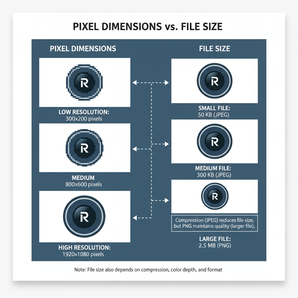
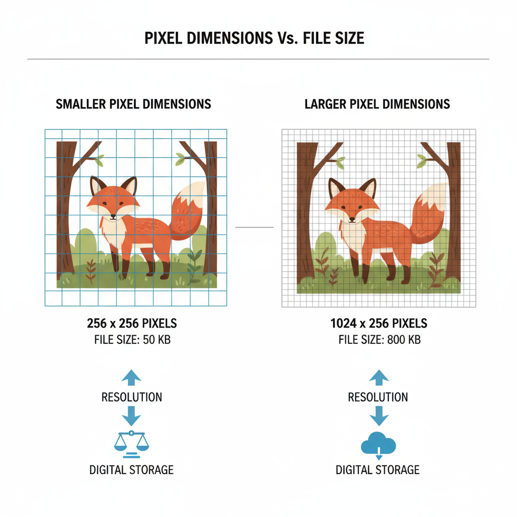
Pixel Dimensions vs. File Size
Before applying best practices, it’s important to separate pixel dimensions from file size:
- Pixel dimensions: The width × height of the display area in pixels (e.g., 1920×1080). This affects how much content appears without scrolling or zooming.
- File size: The amount of data in kilobytes (KB) or megabytes (MB) needed to load the page. A large file size can slow load times regardless of pixel dimensions.
Example: A 1920‑pixel‑wide banner will display full‑width on most desktops, but if saved at 5 MB rather than an optimized 250 KB, it will load far slower.
---
Standard Viewport Sizes for Devices
When discussing website page size in pixels, viewport width is a major concern. Devices typically fall into certain ranges:
| Device Type | Common Viewport Widths (px) | Example Devices |
|---|---|---|
| Desktop / Laptop | 1024, 1280, 1440, 1920 | PC monitors, MacBooks |
| Tablet | 768, 800, 1024 | iPad, Kindle Fire |
| Mobile | 320, 375, 414, 480 | iPhone, Android phones |
Always verify with real device testing—pixel counts vary widely by model and resolution.
---
Common Full-Width Pixel Ranges
Responsive websites often use container widths that adjust according to device breakpoints. Typical “full-width” ranges include:
- Small mobile: 320–480 px
- Large mobile: 481–767 px
- Tablet portrait: 768–1023 px
- Desktop standard: 1024–1440 px
- Large desktop: 1441–1920+ px
Designing for these ranges increases the likelihood that your layout remains visually consistent.
---
Pixel Dimensions and User Experience
Pixel dimensions have a direct impact on:
- Readability: Keep text line length comfortable to prevent reader fatigue.
- Layout balance: Align imagery and grids to common pixel widths for visual harmony.
- Interaction ease: Ensure button and link sizes are adequate for tapping on mobile screens.
A user‑focused pixel design improves usability and satisfaction.
---
Role of CSS Breakpoints
Responsive design adapts layouts through CSS breakpoints, which trigger style changes at specific viewport widths.
Example CSS:
/* Mobile-first design */
.container {
  width: 100%;
}

/* Tablet breakpoint */
@media (min-width: 768px) {
  .container {
    max-width: 720px;
  }
}

/* Desktop breakpoint */
@media (min-width: 1024px) {
  .container {
    max-width: 960px;
  }
}
Breakpoints should align with prevalent viewport sizes to ensure appearance and function remain consistent across devices.
---
Checking Your Website’s Page Size
You should evaluate both pixel dimensions and file size:
Pixel dimensions tools:
- Browser Developer Tools (Chrome, Firefox) allow instant viewport size previews via the device toolbar.
- Online viewport testing tools such as responsivedesignchecker.com.
File size tools:
- GTmetrix and Google PageSpeed Insights for performance metrics, load times, and optimization suggestions.
---
Best Practices for Pixel-Based Design
- Start mobile-first: Build for the smallest screen, then scale upward.
- Use fluid layouts: Let elements scale within a range of pixel values.
- Plan strategic breakpoints: Position them around the most common device widths.
- Test on real devices: Detect subtle misalignments overlooked by emulators.
- Consider high‑DPI displays: Provide higher‑resolution assets for retina screens.
---
Optimizing Images and Media
High pixel dimensions don’t have to mean large, slow-loading files. Keep designs fast and sharp by:
- Implementing `srcset` and `sizes` for responsive images.
- Using formats like WebP or AVIF for better compression with quality retention.
- Compressing images with tools such as TinyPNG or Squoosh.
- Avoiding excessive decorative graphics on narrow viewports to reduce scroll fatigue.
Example:
---
Accessibility and Pixel Dimensions
Pixel sizing also affects accessibility:
- Scalable text: Use relative units (`em` or `rem`) for font sizes, honoring user settings.
- Touch targets: Aim for at least 44×44 px touch areas.
- Zoom support: Avoid fixed-pixel layouts that break under browser zoom.
Applying accessible pixel sizing benefits all users, especially those with visual or mobility impairments.
---
Future Trends: High-DPI, 4K, and Retina Displays
With high‑DPI and 4K displays becoming mainstream, pixel density (PPI/DPI) complicates the relationship between physical and CSS pixels.
Key trends:
- SVG icons replacing raster for crisp scaling at any resolution.
- Multiple resolution images to serve retina screens efficiently.
- Fluid and responsive typography guaranteeing layout stability at varying densities.
Monitoring emerging tech ensures your responsive design stands the test of time.
---
Summary and Next Steps
Mastering website page size in pixels enables you to create responsive, accessible, and high‑performing websites. Know the difference between pixel dimensions and file size, design around common viewport ranges, leverage CSS breakpoints, and optimize your media—all while keeping accessibility in mind.
Use this knowledge to audit and refine your own site. Start by testing current pixel widths, setting appropriate breakpoints, and optimizing images.
Ready to enhance your web design? Apply these pixel‑perfect strategies today to deliver an exceptional experience across all devices and resolutions.