Website PX Dimensions and Standard Pixel Sizes for Web Desig
Learn key website pixel dimensions, responsive breakpoints, and recommended image sizes to create layouts that are clear, consistent, and device-friendly.

Introduction to Pixel Dimensions and Website PX Sizes in Web Design
In modern web design, pixel dimensions—often referred to as website px dimensions—are among the most critical concepts to understand and apply effectively. A pixel represents a single point in a digital image or display. However, in the context of a website, pixel dimensions define the fixed width and height (in pixels) that determine how images, layout elements, and components render on users’ screens.
Whether designing a hero banner, structuring a responsive grid, or creating icons, knowing the standard website px dimensions ensures that your layout is visually appealing, accessible, and optimized for performance across devices. Consistent pixel sizing avoids blurry graphics, awkward cropping, or layout shifts that could frustrate visitors and harm usability.
---
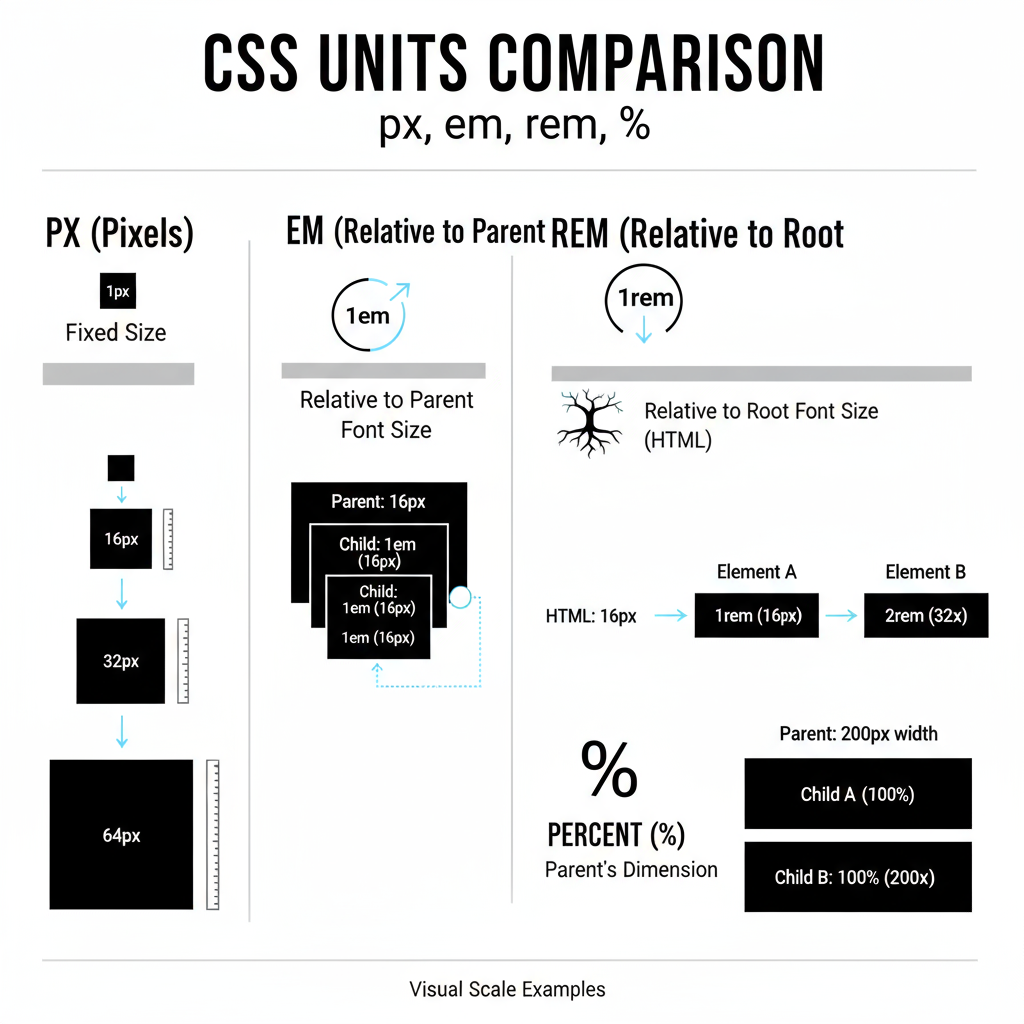
Difference Between px, em, rem, and Percentage Units
While px (pixels) are the most straightforward unit in web design, other relative units add valuable flexibility:
- px (Pixels): Absolute values that remain the same regardless of screen or browser settings; precise but less adaptive.
- em: Relative to the font size of the parent element — useful for scalable typography and proportional spacing.
- rem: Relative to the root (`html`) font size — ensures global consistency in responsive designs.
- % (Percentage): Based on the parent container's dimensions — ideal for fluid, flexible layouts.
A balanced approach often uses px for fixed-dimension assets and em/rem/% for scalable text and spacing, enhancing responsiveness without sacrificing precision.
---
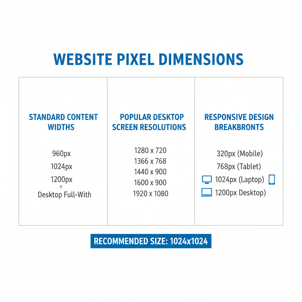
Common Website Pixel Dimensions for Desktop
When discussing common website px dimensions for desktop experiences, attention is usually on your content container width and grid system.
Standard Content Widths
Most designers aim for widths between 960px and 1440px to maintain readability while leveraging large displays effectively.
Popular Desktop Breakdowns
| Screen Resolution | Common Content Width | Grid System |
|---|---|---|
| 1920×1080 | 1140px–1440px | 12-column (Bootstrap default) |
| 1680×1050 | 1140px | 960 Grid / 12-column |
| 1440×900 | 1140px | Custom fluid grid |
| 1366×768 | 960px–1140px | Legacy 960 Grid |
Using max-width constraints in CSS ensures layouts adapt smoothly across varying desktop resolutions.
---
Responsive Design: Standard Breakpoints and PX Ranges
Responsive design relies on breakpoints — specific pixel widths where layout rules change to fit the device:
Common Breakpoints
- Large desktops: ≥ 1200px
- Desktops/Laptops: 992px – 1199px
- Tablets: 768px – 991px
- Mobile devices: ≤ 767px
- Small mobile (portrait): ≤ 480px
Example media queries:
@media (max-width: 991px) {
  /* Tablet styles */
}

@media (max-width: 767px) {
  /* Mobile styles */
}
Proper breakpoint planning ensures better usability and accessibility on all devices.
---
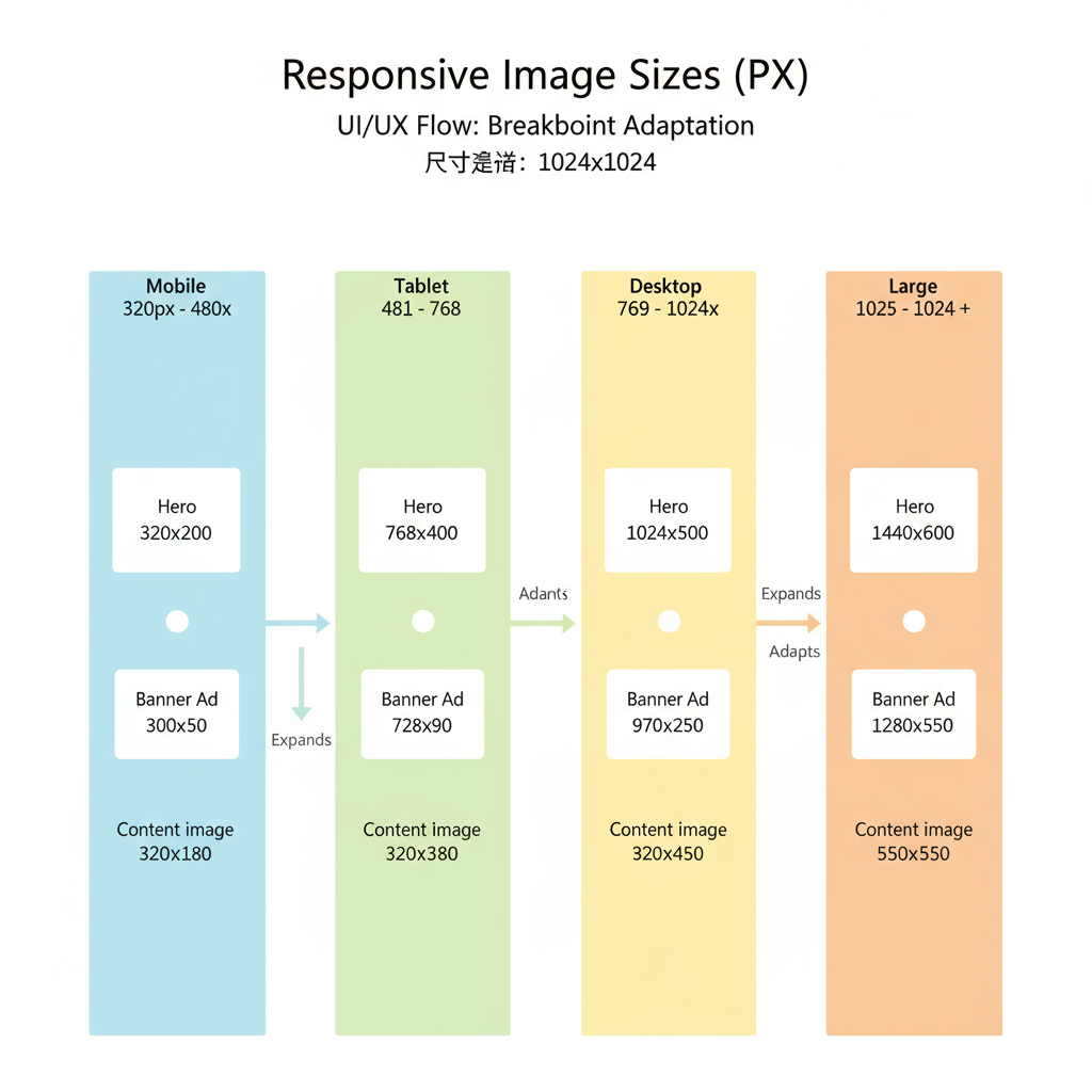
Recommended Hero Image, Banner, and Content Image Pixel Sizes
Different sections on a website require particular pixel dimensions for clarity and load performance:
| Element | Recommended Width | Recommended Height | Notes |
|---|---|---|---|
| Hero image (full-width) | 1920px | 1080px or adaptive | Keep under 1MB in size |
| Hero image (centered) | 1600px | 900px | Balance detail with file size |
| Banner | 1920px | 600–800px | Prefer lightweight SVGs if possible |
| Content images | 800–1200px | Variable | Ideal for blog posts and galleries |
Matching image dimensions with intended display size prevents quality loss or excess load time.
---
Favicon and Icon Pixel Dimensions
Small assets like favicons and icons factor strongly into brand visibility. They must remain clear on high-density screens.
Common Favicon Sizes:
- 16×16 px: Traditional favicon size for browser tabs.
- 32×32 px: Higher resolution for certain browsers.
- 48×48 px: Suitable for Windows desktop shortcuts.
- 180×180 px: Recommended for iOS homescreen icons.
- 512×512 px: Ideal for Android splash screen icons.
A multi-size `.ico` file ensures compatibility across platforms.
---
Pixel Dimensions for Social Media Embeds
For embedded social content, use platform-specific pixel dimensions to maintain sharpness and branding:
| Platform | Embed Element | Recommended Width | Recommended Height |
|---|---|---|---|
| Feed photo | 1080px | 1080px | |
| Post embed | 1200px | 630px | |
| Twitter (X) | Card image | 1200px | 675px |
| YouTube | Embedded video | 1280px | 720px |
Correct sizing prevents distortion and ensures the embedded media integrates seamlessly into your design.
---
Tips for Optimizing Images Without Losing Quality
Even with accurate website px dimensions, unoptimized images can slow down your site:
- Compress smartly using TinyPNG, Squoosh, or ImageOptim.
- Select the best format: JPG for photographs, PNG for transparency, WebP for balance.
- Enable lazy loading to defer off-screen image downloads.
Use responsive `
` attributes like `srcset` to serve appropriate sizes.
Example:
---
Tools for Measuring and Testing Website PX Dimensions
Designers and developers depend on accurate measurements to maintain consistency:
- Browser DevTools: Inspect and measure rendered px sizes in real time.
- Figma/Adobe XD: Include guides and presets for common website px dimensions.
- Responsively App: Preview and test multiple device views at once.
- Lighthouse / PageSpeed Insights: Evaluate image sizes and performance impact.
- Polypane: Advanced multi-view breakpoints testing.
---
Conclusion: Best Practices for Responsive Pixel Design
Understanding website px dimensions goes beyond memorizing numbers — it’s about crafting scalable, responsive designs. By combining precise px units for fixed visual assets with scalable em, rem, and percentage units, you can ensure that your digital interface adapts beautifully to any screen resolution.
Key takeaways:
- Rely on standard widths and responsive breakpoints for layout consistency.
- Compress and optimize all assets for performance without losing visual fidelity.
- Test your design regularly across various devices and resolutions.
- Use professional tools for precise dimension measurement and responsive previews.
Implementing these best practices will help you create polished, high-performing layouts that enhance user experience and future-proof your web design projects. For more resources on mastering responsive design and pixel-perfect layouts, consider exploring comprehensive front-end development guides or enrolling in advanced CSS courses.