What Is the Average Picture Size for Web and Print Use
Learn the ideal image dimensions, resolution, and file sizes for web and print to ensure clarity, fast loading, and professional quality output.

Understanding the Average Picture Size for Web and Print Use
When people search for the average picture size, they may refer to either image dimensions (width × height in pixels or inches) or file size (storage space in kilobytes or megabytes). Both metrics are crucial for determining how an image will appear online, in print, and how fast it will load on a webpage.
This comprehensive guide explains average picture sizes for web and print, comparing formats, resolutions, and optimization techniques, so you can select the right settings for any project.
---
Defining "Picture Size"
Dimensions vs. File Size
- Dimensions – The physical measurement of an image in pixels (digital) or inches/centimeters (print).
- File size – The space the image file occupies on storage media, measured in KB, MB, or GB.
While these are related, they are not the same. An image of identical dimensions can have very different file sizes depending on its resolution, compression level, and file format.
---
Image Dimensions in Pixels
Digital images are made of pixels—tiny colored squares arranged in a grid. Dimensions are expressed as width × height. For example, 1920 × 1080 pixels means the image is 1920 pixels wide and 1080 pixels high.
Why Pixels Matter
- On screens — They determine how crisp an image looks and whether it fills the intended space without distortion.
- In print — Pixel dimensions, combined with DPI/PPI, set the final inch or centimeter size on the page.
---
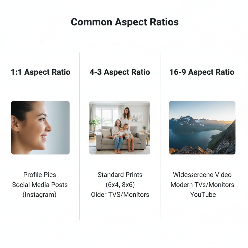
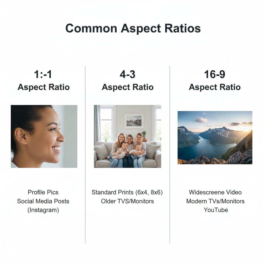
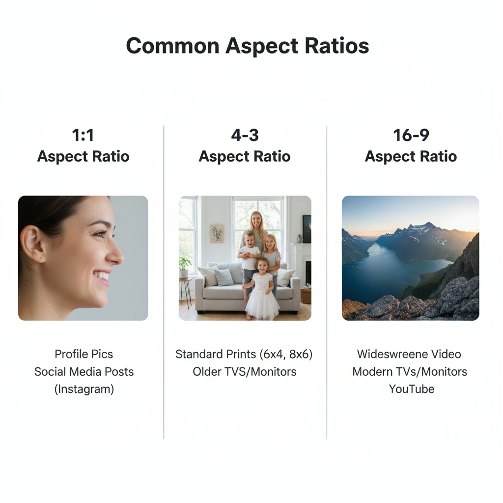
Common Image Aspect Ratios
An aspect ratio describes the proportional relationship between width and height. Three predominant ratios are:
| Aspect Ratio | Description | Common Use |
|---|---|---|
| 4:3 | Balanced rectangle | Classic photos, older TV screens |
| 16:9 | Widescreen rectangle | Modern monitors, HD videos |
| 1:1 | Perfect square | Social media profile images |
Maintaining the same aspect ratio helps prevent cropping or distortion across devices and platforms.
---
Common Sizes for Web Use
The average picture size online varies based on platform and purpose:
- Blog feature images: 1200 × 800 px for a good balance of width and file size.
- Social media:
- Instagram post: 1080 × 1080 px (1:1)
- Facebook cover: 820 × 312 px
- Twitter header: 1500 × 500 px
- Web ads:
- Leaderboard: 728 × 90 px
- Medium rectangle: 300 × 250 px
These sizes preserve clarity without unnecessarily increasing load times.
---
Standard Print Photo Sizes
Print images are measured in inches and depend on DPI (dots per inch) for sharpness:
- 4 × 6 in — Postcards, basic small prints
- 5 × 7 in — Small portrait frames
- 8 × 10 in — Standard photo frames
- 11 × 14 in — Posters
A 300 DPI resolution is considered professional quality for prints.
---
File Size Considerations
The weight of an image impacts:
- Website speed — Smaller files load faster, improving SEO and user experience.
- Storage limits — Many hosting providers and email services limit file sizes.
- Mobile usage — Large files drain data and slow downloads.
For websites, most images work well between 100 KB and 500 KB. For high-quality prints, file sizes can reach several MB.
---
PPI/DPI and Perceived Quality
- DPI — Dots per inch (printers)
- PPI — Pixels per inch (screens)
Guidelines:
- Web images: 72–96 PPI is sufficient.
- Print images: 300 PPI yields crisp, detailed output.
Conversion formula:
pixels = inches × DPIExample: 4 × 6 in at 300 DPI → `1200 × 1800` pixels.
---
File Format Examples and Sizes
File type greatly influences compression and size. For a 1920 × 1080 px image:
| Format | Typical File Size | Best Use Case |
|---|---|---|
| JPEG | 150–400 KB | Photographs with smooth gradients |
| PNG | 400–1200 KB+ | Graphics with text or transparency |
| WEBP | 80–250 KB | Web-optimized with minimal quality loss |
---
Choosing the Right Picture Size
Factors to consider:
- Purpose — Web display or print output?
- Target device — Desktop, mobile, or both?
- Bandwidth limits — Optimize for slower connections if needed.
- Aesthetic needs — Maintain visual quality and composition.
Rule of thumb:
- For web: Aim for the smallest file size possible without visible quality loss.
- For print: Prioritize resolution.
---
Best Practices for Optimization
- Resize images to display size before upload.
- Compress using modern formats like WEBP or optimized JPEG.
- Lazy-load images below the fold to improve load speed.
- Leverage a CDN to serve images faster worldwide.
Avoid uploading large files and relying solely on HTML/CSS resizing—that still forces full downloads.
---
Tools for Resizing and Compression
Reliable options include:
- TinyPNG / TinyJPG — Browser-based compression.
- ImageOptim — macOS app for lossless image optimization.
- Squoosh — Free Google tool for browser-based resizing.
- Adobe Photoshop — Professional editing and exporting.
- GIMP — Open-source image editor.
---
Summary and Quick Reference
The average picture size varies by purpose. For most websites, an image at or below 1200 px wide and under 500 KB achieves a strong balance of load time and clarity. For print, measure in inches at 300 DPI.
Quick Reference Chart
| Use Case | Dimensions | DPI/PPI | File Size Target |
|---|---|---|---|
| Blog Feature Image | 1200 × 800 px | 72 PPI | <400 KB |
| Instagram Post | 1080 × 1080 px | 72 PPI | <300 KB |
| 4 × 6 in Print | 1200 × 1800 px | 300 DPI | 1–4 MB |
| A4 Print | 2480 × 3508 px | 300 DPI | 3–8 MB |
---
By understanding the interplay between dimensions, file size, resolution, and display medium, you can select the ideal picture size for any situation. This ensures your images look crisp, load quickly, and perform well for both web users and print applications. For more tips on web performance and image optimization, consider bookmarking this guide and sharing it with your design or content team.