Instagram Grid Size Guide and Feed Layout Tips
Learn Instagram grid sizes, post dimensions, and feed layout strategies to create a cohesive, visually appealing profile that boosts engagement.

Instagram Grid Size Guide and Feed Layout Tips
Instagram is one of the most visually driven social media platforms, and your feed’s appearance plays a critical role in shaping first impressions. Whether you’re a brand, influencer, or creative storyteller, knowing what is the Instagram grid size and how to implement a well-planned feed layout can greatly enhance engagement and professional appeal. This guide covers optimal post dimensions, creative planning techniques, and proven layout strategies to help you design a cohesive and impactful Instagram presence.
---
Understanding the Instagram Grid
The Instagram grid is the tiled arrangement of posts on your profile page. Displayed in rows of three columns, it forms an at-a-glance portfolio for your content.
Key points:
- 3-column layout: Three images per row.
- Uniform white space: Consistent spacing enhances aesthetics.
- Static order: Posts display chronologically; reordering requires deletion and reposting.
---
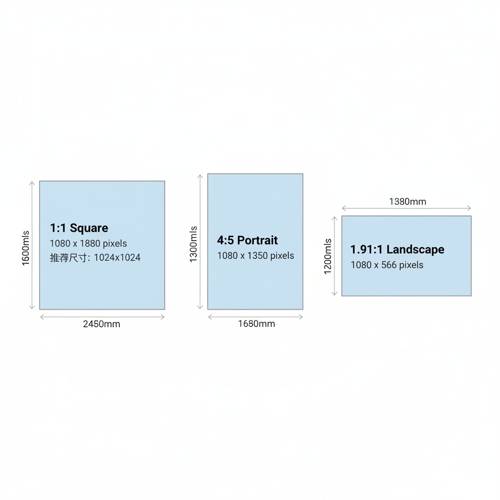
Standard Instagram Post Sizes
Creating high-quality content begins with uploading at the recommended resolutions for each aspect ratio. This ensures your visuals remain sharp after compression.
| Format | Aspect Ratio | Recommended Size (px) |
|---|---|---|
| Square | 1:1 | 1080 x 1080 |
| Portrait | 4:5 | 1080 x 1350 |
| Landscape | 1.91:1 | 1080 x 566 |
---
1:1 Aspect Ratio — Square Posts
A square image (1:1 ratio) has equal width and height, with a recommended resolution of 1080x1080 pixels. Square posts are the most consistently neat within the grid.
Benefits:
- Perfect fit in the profile grid.
- Simple, predictable design.
- No unexpected cropping.
---
4:5 Aspect Ratio — Portrait Posts
Portrait posts (4:5 ratio) have more vertical space, recommended at 1080x1350 pixels. This format captures attention in scrolling feeds.
Tips:
- Centralize important details to avoid cropping in grid preview.
- Use extra vertical space for storytelling visuals.
---
1.91:1 Aspect Ratio — Landscape Posts
Landscape posts (horizontal format) offer a cinematic feel at 1080x566 pixels.
Considerations:
- Grid previews crop to square.
- Keep focal points within a centered safe zone.
---
Profile Grid Display
Your profile grid:
- Shows three columns per row.
- Orders posts from newest to oldest.
- Crops all previews to squares regardless of original aspect ratio.
---
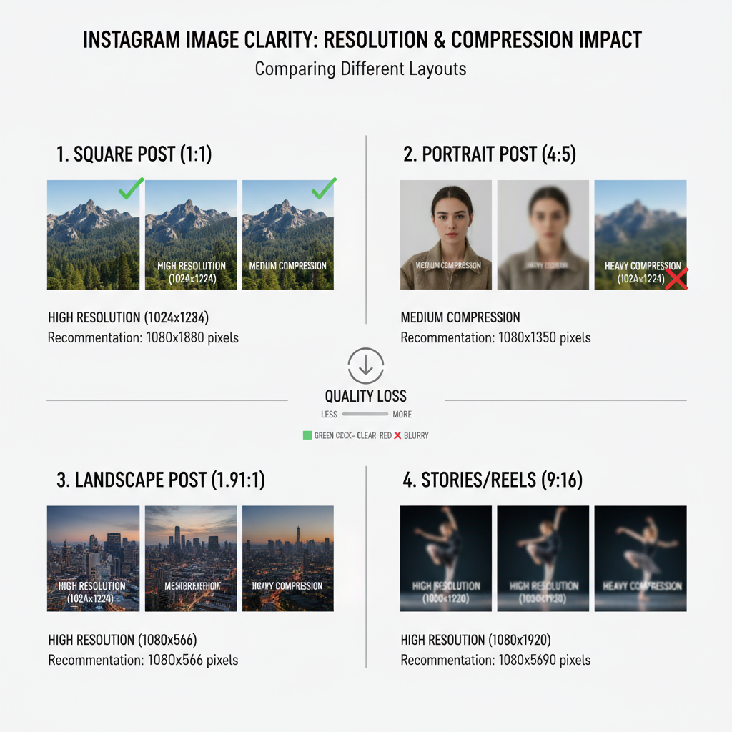
Resolution and Compression
Instagram compresses files to optimize load times. Mitigate quality loss by:
- Uploading at recommended resolutions.
- Saving as JPEG with sRGB color profile.
- Using minimal fine text to prevent pixelation.
Compression effects:
- Slight blur in detailed areas.
- Subtle color shifts.
- Possible banding in gradients.
---
Planning a Cohesive Grid Theme
Grid planning ensures your profile reflects a consistent style.
Popular strategies:
- 3x3 layouts: Create a themed set of 9 posts as one larger story.
- Single row themes: Align visual or color elements across one row.
- Checkerboard patterns: Alternate styles to create rhythm.
---
Using Grid Planning Apps and Templates
Visual planners make it easier to maintain feed harmony.
Popular options:
- Preview
- Plann
- UNUM
- Later
- Canva (with grid templates)
Advantages:
- Drag-and-drop arrangement.
- Test color schemes before posting.
- Schedule for optimal audience reach.
---
Incorporating Story Highlights
Highlights extend your visual identity, appearing below the bio.
Highlight tips:
- Use cohesive cover icons.
- Organize stories into clear categories.
- Match highlight colors with grid tones.

---
Balancing Colors and Patterns Across Rows
Balanced composition enhances the professional look of a feed.
Tactics:
- Space out bold colors across posts.
- Mix close-ups and wide shots for variety.
- Evenly distribute text-based posts.
Color palette tips:
- Choose 3–5 complementary colors.
- Apply consistent filters or presets.
- Uniformly adjust saturation levels.
---
Common Grid Layout Mistakes to Avoid
Avoid these common pitfalls:
- Inconsistent editing styles.
- Overuse of repetitive text overlays.
- Ignoring crop safe zones.
- Overloading images with elements.
Maintaining visual discipline safeguards your feed’s appeal.
---
Examples of Brand and Influencer Strategies
Brand Examples
- Minimalist brands: Neutral backgrounds, consistent lighting, clean composition.
- Lifestyle brands: Blend product shots with lifestyle scenes.
Influencer Examples
- Travel influencers: Landscape shots with coordinated color presets.
- Fashion bloggers: Mix flat lays and portraits with consistent backdrops.
---
Summary
Understanding Instagram grid size and leveraging smart layout design transforms a profile from a random collage into a visually compelling brand story. Respecting aspect ratios, pre-planning posts with apps, and balancing color schemes can help your feed stand out and drive audience growth.
If you’re ready to optimise your Instagram presence, start planning your next nine posts today—your future followers will notice the difference.


