What Size Is This Image and How to Check Dimensions
Learn how to check image dimensions and file size on desktop, mobile, and online tools, plus tips for choosing the right resolution for web and print.
Introduction: Why Image Size Matters for Web and Print
In today’s digital-first world, image size is a critical factor influencing how your visuals appear and perform across websites, print materials, and social media. Whether you are designing a webpage, preparing a brochure, or crafting posts for Instagram, understanding what size is this image ensures your content is sharp, loads fast, and displays correctly on every platform.
Image size directly impacts:
- Website load time — Large files affect page speed and hurt search engine visibility.
- Print quality — High-resolution images are needed for crisp, professional prints.
- Social media presentation — Adhering to recommended platform dimensions helps avoid awkward cropping.
If you have ever wondered, “What size is this image?”, the following guide explains how to check dimensions and file size on various devices, differentiate between resolution types, and choose optimal image settings for different platforms.

---
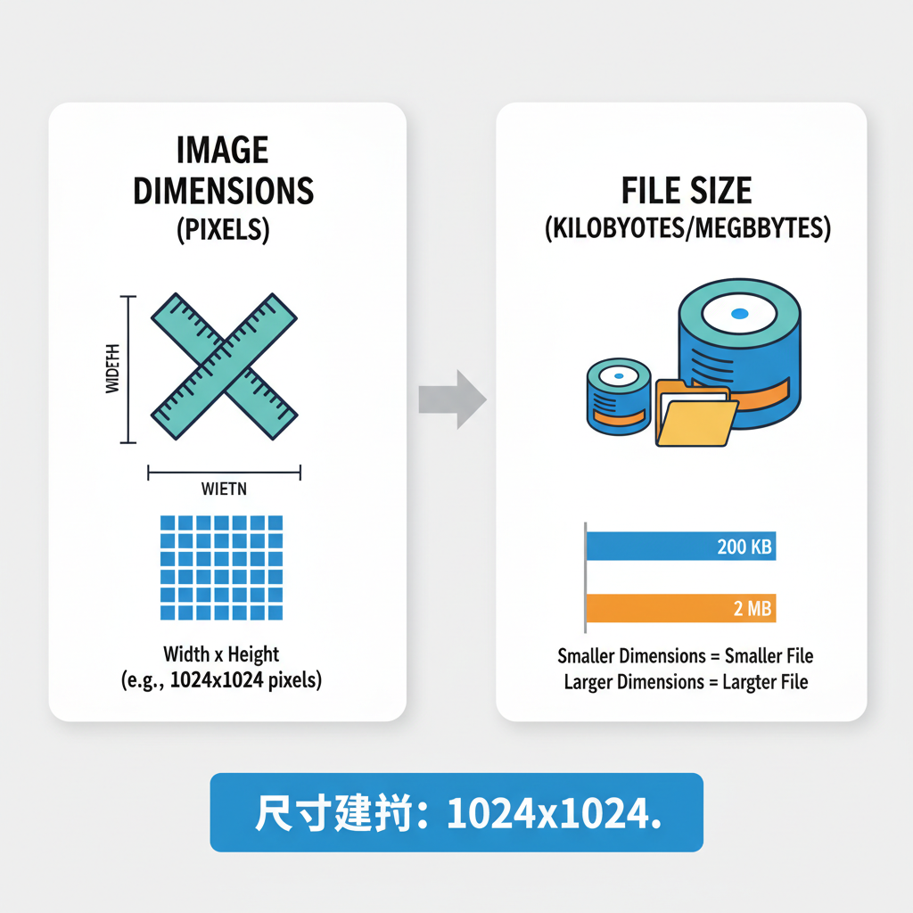
Image Dimensions vs. File Size: The Key Differences
Before learning how to check image size, it’s essential to distinguish between dimensions and file size:
- Dimensions — The width and height of an image in pixels (e.g., 1920 × 1080 px).
- File size — The storage space required, measured in KB, MB, or GB.
A small-dimension image can have a large file size if it uses high resolution or minimal compression, and vice versa. Understanding both values helps you balance quality with performance.
---
How to Check Image Size on Desktop Systems
Finding out what size is this image on Windows or macOS is straightforward.
On Windows
- Right-click the image file.
- Select Properties.
- Click the Details tab.
- Look for Dimensions (pixels) and Size (file weight).
On macOS
- Right-click the image file.
- Choose Get Info or press `Command + I`.
- Under More Info, review Dimensions and File Size.
---
How to Check Image Size on Mobile Devices
Since many tasks are performed on smartphones, it’s useful to know how to check an image’s size on the go.
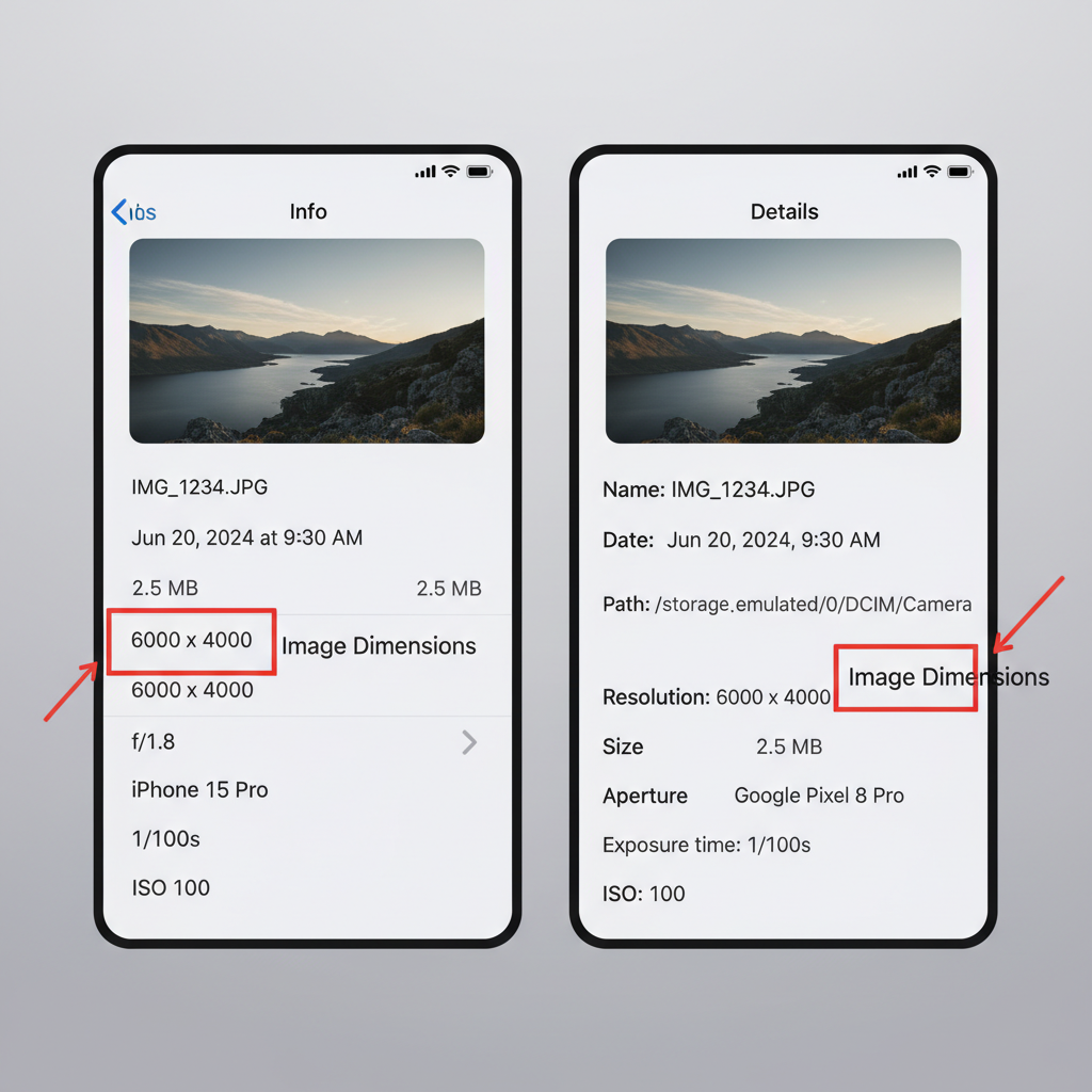
On iOS (iPhone / iPad)
- Open the Photos app.
- Select the image.
- Tap the i (info) icon or swipe up.
- View the Dimensions and File Size (iOS 15+). For more data, consider a tool like Exif Viewer.
On Android
- Open the Gallery or Google Photos app.
- Select the image.
- Tap the three dots menu or Details.
- Review dimensions and file size. For missing info, use apps such as Photo Exif Editor.
---
Using Online Tools to Determine Image Size
If direct file info isn’t available, online tools can instantly reveal image properties without extra software installation.
Popular free tools:
- Image Online.co — Upload an image to view size and dimensions.
- ResizePixel — Check, resize, and optimize images.
- PicResize — Resize and preview results online.
How it works:
- Open the chosen tool in your browser.
- Upload your image.
- Instantly see its width, height, and file size.
---
Understanding Resolution: PPI vs. DPI
Resolution measures image detail:
- PPI (Pixels Per Inch) — Digital display clarity.
- DPI (Dots Per Inch) — Print sharpness, indicating ink dots per inch.
For print, aim for 300 DPI for high-quality output. For web, 72 PPI is standard. Knowing your resolution needs prevents blurred digital images and pixelated prints.
---
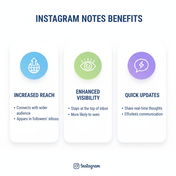
Recommended Image Sizes for Common Platforms
Different platforms have unique image requirements to ensure optimal display.
| Platform | Optimal Image Size | Notes |
|---|---|---|
| Instagram Post | 1080 × 1080 px | Square format; compresses larger files |
| Facebook Cover | 820 × 312 px | Keep vital text within safe area |
| Twitter Header | 1500 × 500 px | Widescreen aspect ratio recommended |
| Pinterest Pin | 1000 × 1500 px | Vertical orientation performs best |
| Website Hero Image | 1920 × 1080 px | Balance quality with optimized load time |
---
Image Size, Load Speed, SEO, and UX
Oversized images can slow down loading, affecting:
- Page speed — Visitors may bounce from slow sites.
- Search engine ranking — Google favors faster pages.
- User satisfaction — Slow media frustrates mobile users.
Tools like Google PageSpeed Insights identify image-related bottlenecks and offer optimization tips.
---
Resizing and Compressing Images Without Quality Loss
To optimize images before uploading:
Useful Tools
- TinyPNG / TinyJPG — Smart compression with minimal quality loss.
- ImageOptim — Effective for Mac users.
- Adobe Photoshop — Save for Web for full export control.
Best Practices
- Create images at the desired pixel dimensions for each platform — avoid only HTML/CSS scaling.
- Choose the right file format: JPEG (photos), PNG (transparent graphics), WebP (lightweight high quality).
- Use lossless compression when possible.
- Monitor both pixel dimensions and file size.
---
Final Pre-Publish Image Optimization Checklist
Before publishing, verify:
- Correct format for use (JPEG, PNG, WebP, GIF, etc.).
- Dimensions follow platform guidelines.
- File size is small enough for quick loading.
- Resolution matches output type (print or web).
- Compression retains acceptable quality.
- Accurate and descriptive alt text for accessibility and SEO.
---
Summary and Next Steps
By mastering image dimensions, file sizes, and resolution, you can fully answer the question “What size is this image?”—and more importantly, use that knowledge to improve performance, quality, and SEO. Whether working on desktop, mobile, or online tools, you now have the techniques to check and optimize any image for its intended purpose.
Pro tip: Implement these practices consistently to enhance your site’s load speed, search rankings, and user satisfaction. Start optimizing your images today to make your content look and perform at its best.