Best Photo Sizes for Websites: Pixel Dimensions Guide
Learn the best pixel dimensions for website images, from hero banners to thumbnails, plus formats and responsive optimization tips for speed and SEO.
Best Photo Sizes for Websites: Pixel Dimensions Guide
Selecting the best photo sizes for your website is vital for achieving a fast, visually striking, and user-friendly design. Oversized images can slow page speed, harm user experience, and damage SEO, while undersized photos may appear blurry and unprofessional. In this guide, you’ll learn what size photos for website content work best across devices, plus optimization techniques and key tools to help you deliver sharp, efficient images that enhance your brand online.

---
Why Photo Dimensions Matter for Web Performance
Image pixel dimensions directly affect page weight and site speed. Large, high-resolution images might look great in a design mockup, but if they’re not compressed or scaled correctly, they can cause sluggish performance.
Correct sizing improves:
- Faster load times – Smaller files download more quickly.
- Better user experience – Smooth browsing keeps visitors engaged.
- Improved SEO – Search engines consider page load speed for rankings.
- Reduced bandwidth costs – Lighter images lower hosting and data use.
The goal is a balance between high quality and optimal performance.
---
Common Website Image Types
Every section of a website may require different image proportions and dimensions. Recognizing common image types allows you to plan sizing accurately.
- Hero images – Large banners or headers spanning the top of a web page.
- Product photos – High-detail shots for e-commerce platforms.
- Blog thumbnails – Smaller preview images next to blog titles.
- Gallery images – Collections displayed in grids or carousels.
---
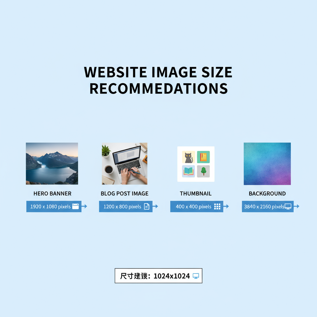
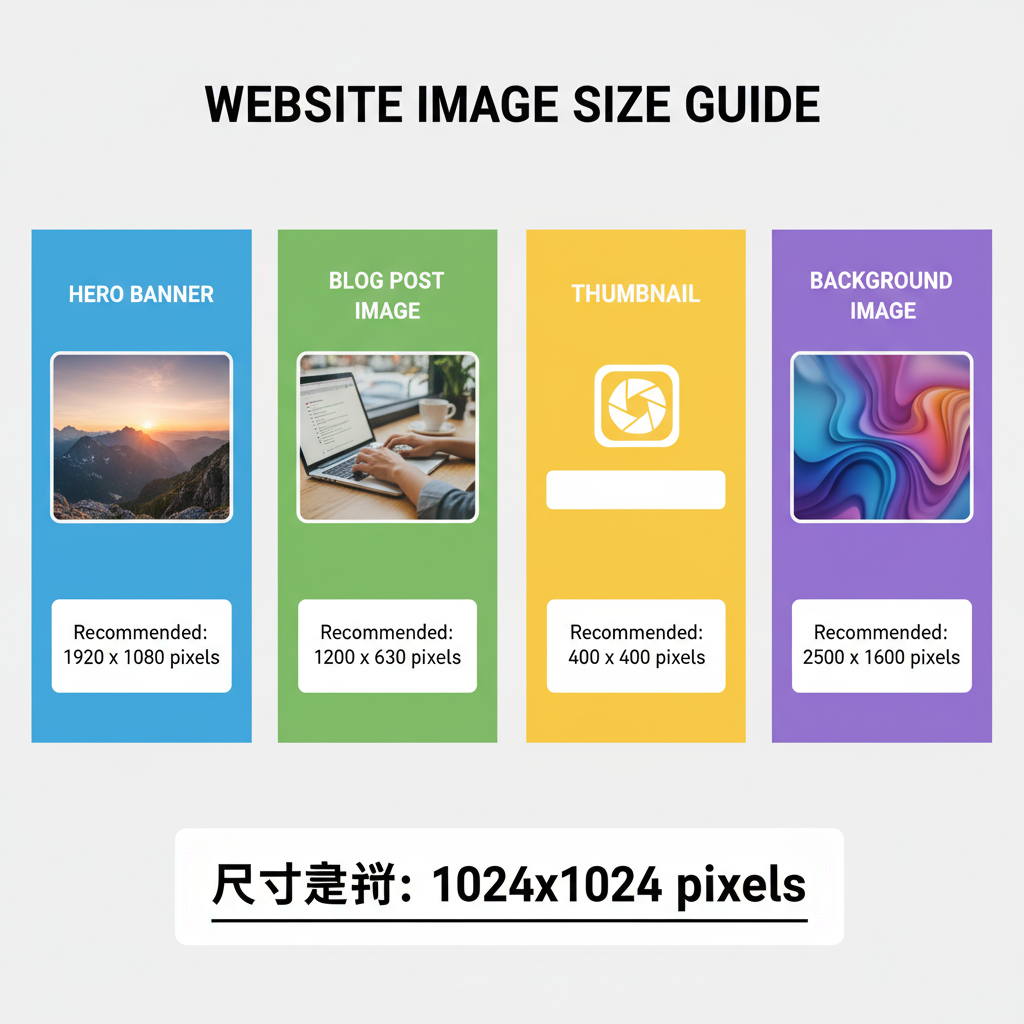
Recommended Pixel Dimensions for Each Image Type
Exact sizes can vary depending on your CMS or theme, but these general recommendations provide a strong starting point.
| Image Type | Desktop Width × Height (px) | Mobile Width × Height (px) | Responsive Strategy |
|---|---|---|---|
| Hero Image | 1920 × 1080 | 1080 × 720 | Use CSS background-size: cover and srcset |
| Product Photo | 800 × 800 | 400 × 400 | Maintain square ratio in responsive containers |
| Blog Thumbnail | 1200 × 628 | 600 × 314 | Preserve fixed aspect ratio for blog layouts |
| Gallery Image | 1600 × 1200 | 800 × 600 | Serve smaller images for mobile breakpoints |
These should be adapted to match your site’s design and content delivery strategy. Always verify theme specifications before uploading.
---
Understanding File Formats: JPEG, PNG, WebP
Choosing the right format impacts both size and quality:
- JPEG – Ideal for photographs; offers lossy compression for reduced size.
- PNG – Excellent for graphics and transparency; lossless but larger files.
- WebP – Modern format with strong compression and quality retention; widely supported.
Pro Tip: Serve WebP to modern browsers with fallbacks for maximum compatibility.
---
Balancing Resolution, Quality, and Load Speed
Your image’s resolution, quality settings, and resulting file size all influence performance.
- Resolution – Width × height in pixels.
- Quality – Degree of compression; lower quality reduces weight.
- Load speed – Impacted by file size, format, and hosting.
DPI vs PPI Explained
- DPI (Dots Per Inch) – Relevant for print, not for screens.
- PPI (Pixels Per Inch) – Pixel density affecting clarity on displays.
For web use, prioritize pixel dimensions over DPI.
---
Responsive Design and Adaptive Image Sizes
Responsive images ensure a consistent experience on desktop, tablet, and mobile. HTML and CSS features like `srcset` and `sizes` adapt image delivery.
This method delivers optimal quality while minimizing load on smaller screens.
---
Tools for Resizing and Optimizing Images
Optimize before uploading using:
- Adobe Photoshop – Comprehensive size and compression control.
- GIMP – Free, open-source editor.
- TinyPNG / TinyJPG – Web-based compression tools for PNG/JPEG.
- Squoosh – Google’s WebP converter and optimizer.
- ImageMagick – Command-line tool for batch resizing.
---
Testing Photo Sizes Across Devices
Before publishing:
- Browser developer tools – Preview across breakpoints.
- Real device tests – Assess appearance and performance in actual use.
- Speed tools – PageSpeed Insights, GTmetrix to detect heavy assets.
Testing safeguards against visual inconsistencies and slow loading.
---
SEO Benefits of Properly Sized Photos
Correctly optimized photos aid:
- Higher rankings – Through faster load speeds.
- Better user metrics – Lower bounce rates improve signal to search engines.
- Enhanced search appearance – Using structured data for eligibility in image-rich SERPs.
Always provide:
- Alt text – Accessibility and keyword relevance.
- Descriptive file names – e.g., `red-running-shoes.jpg` instead of `IMG_1234.jpg`.
- Schema markup – Particularly for products or recipes.
---
Common Mistakes to Avoid
Avoid these image pitfalls:
- Uploading uncompressed, full-resolution stock files.
- Neglecting mobile performance.
- Using PNG for large photos when JPEG is sufficient.
- Skipping lazy loading setup.
- Failing to implement responsive images.
Addressing these points maintains both speed and quality.
---
Summary and Next Steps
Understanding what size photos for website use is key for achieving an appealing yet high-performing online presence. Match dimensions to image type, choose formats wisely, compress effectively, and serve responsive versions.
Resize before upload, select appropriate formats, utilize adaptive delivery, and regularly test performance. Implement these strategies to boost speed, visual impact, and SEO.
CTA: Audit your current site images today—resize, reformat, and optimize them using the tips above to unlock faster loading and higher search rankings.