Best Image Sizes for Websites to Improve Speed and SEO
Learn the best image dimensions, file sizes, formats, and compression methods to boost website speed, user experience, and SEO performance.

Best Image Sizes for Websites to Improve Speed and SEO
When considering what size images should be on a website, it’s important to remember that size impacts far more than aesthetics. Image optimization plays a crucial role in page speed, user experience, and search engine rankings. Oversized visuals can hinder performance and SEO, while correctly sized and compressed images make your site fast, engaging, and well-positioned in search results.
This guide explores recommended dimensions, file sizes, formats, compression methods, and CMS best practices, enabling you to create a visually stunning site that loads quickly and performs well.
---
Why Image Size Matters for Website Performance and SEO
Images often account for the largest portion of web page load weight. Larger-than-needed images can:
- Slow page load times and increase bounce rates.
- Drain mobile data and frustrate visitors.
- Trigger poor Core Web Vitals scores, affecting search rankings.
Optimized images, however:
- Speed up loading.
- Maintain crisp visual quality without excess data usage.
- Send stronger SEO signals through improved performance and user engagement.
---
Image Dimensions vs. File Size
Understanding the distinction between dimensions and file size is essential:
- Dimensions (pixels): The width and height of an image (e.g., 1920×1080 px) determine on-screen display size.
- File Size (KB/MB): The storage space the image occupies. Large dimensions don't always mean a massive file—the format and compression settings also matter.
Even small images can have heavy file sizes if they’re not properly compressed.
---
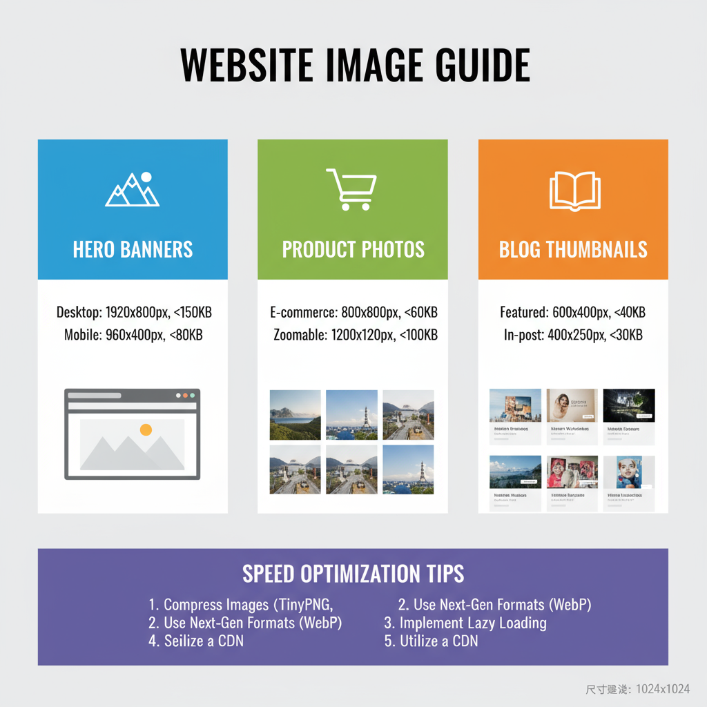
Ideal Image Dimensions for Common Website Layouts
Select dimensions that provide crisp clarity without unnecessary bulk.
| Image Type | Recommended Dimensions | Notes |
|---|---|---|
| Hero Banner | 1920×1080 px | Full-width desktop backgrounds; scale down for mobile displays. |
| Blog Post Main Image | 1200×800 px | Fits well in content areas; suitable for social share previews. |
| Thumbnail | 150×150 px | Perfect for grids, cards, or product listings. |
| Feature Image (Homepage) | 800×600 px | Ideal for highlighted content modules. |
Pro Tip
Never upload an image larger than its maximum display size on your site template.
---
Recommended File Sizes for Fast Loading
Correct dimensions are only half the battle—file size must also be optimized:
- Hero banners: ≤ 500 KB (aim for 200–300 KB)
- Content images: 100–250 KB
- Thumbnails: ≤ 50 KB
For mobile-first sites or low-bandwidth audiences, target even lower sizes without noticeable quality loss.
---
How Responsive Design Affects Optimal Image Sizes
Since modern sites adapt to multiple screen sizes, your desktop images may differ greatly from mobile versions:
- Desktop: Up to 1920 px wide for banners.
- Tablet: Around 1200 px for key visuals.
- Mobile: Typically ≤ 800 px wide.
Use responsive image techniques to serve only the most appropriate file for each device, saving bandwidth and improving speed.
---
Choosing Correct File Formats and Their Impact on Size
Formats drastically change image performance:
- JPEG: Ideal for photos; balances quality and compression.
- PNG: Suitable for transparency and line art; heavier than JPEG.
- WebP: Modern format with smaller sizes for similar quality; widely supported.
- SVG: Vector-based for logos and icons; perfectly scalable.
Migrating PNG/JPEG files to WebP often cuts file sizes by up to 50%.
---
Compression Tools and Techniques
Compression types:
- Lossy compression: Reduces file size with slight quality loss—great for photos.
- Lossless compression: Retains full quality—best for text or icons.
Trusted tools include:
- TinyPNG – compresses PNG/JPEG effectively.
- ImageOptim – Mac application for fast bulk compression.
- Squoosh – browser app supporting WebP.
- ShortPixel – CMS plugin for automated compression.
---
Best Practices for Resizing and Cropping Images in CMS Platforms
On WordPress, Shopify, or Squarespace:
- Resize before upload—don’t depend solely on the CMS.
- Use built-in or plugin compression.
- Maintain fixed aspect ratios matching your theme.
- Avoid direct high-resolution camera uploads; they can exceed 5–10 MB.
Example workflow for WordPress:
- Resize in Photoshop or an online editor.
- Compress via TinyPNG.
- Upload and let WordPress create responsive versions.
---

Using `srcset` and `sizes` for Adaptive Images
HTML attributes allow dynamic image delivery:
Benefits include:
- Serving smaller images to mobile users.
- Faster load times.
- Reduced data consumption.
---
Impact of Oversized Images on Core Web Vitals and Rankings
Oversized assets can harm Largest Contentful Paint (LCP) metrics, pushing load times beyond Google’s recommended < 2.5 seconds. This can:
- Lower page rank.
- Reduce organic traffic.
- Decrease conversions.
Optimized images help meet performance thresholds and improve search visibility.
---
Common Mistakes to Avoid
Avoid these pitfalls:
- Uploading unprocessed high-res images.
- Using PNG for photos instead of JPEG/WebP.
- Failing to optimize for mobile.
- Skipping lazy loading.
- Neglecting pre-upload compression.
---
Summary Checklist for Optimal Image Size
- Identify maximum display needs and resize accordingly.
- Select proper format (JPEG/WebP for photos, PNG/WebP for graphics).
- Compress intelligently, balancing size and quality.
- Preview across devices to ensure clarity.
- Use responsive techniques with `srcset` and `sizes`.
- Enable lazy loading for off-screen images.
- Monitor Core Web Vitals regularly to track improvements.
---
By following these image optimization strategies, you’ll enhance site speed, user experience, and SEO rankings. The right balance of dimensions, file size, and format will ensure your visuals look sharp while loading quickly. Start implementing these tips today to boost your website image optimization and keep your audience engaged from the very first click.