What Is the Image Size of This Image? How to Check Dimensions, File Size, and Display Size Anywhere
Learn what image size really means—pixels, file weight, display and print size—and how to check dimensions on Windows, macOS, iOS, Android, and popular apps.

What Is the Image Size of This Image? A Practical Guide
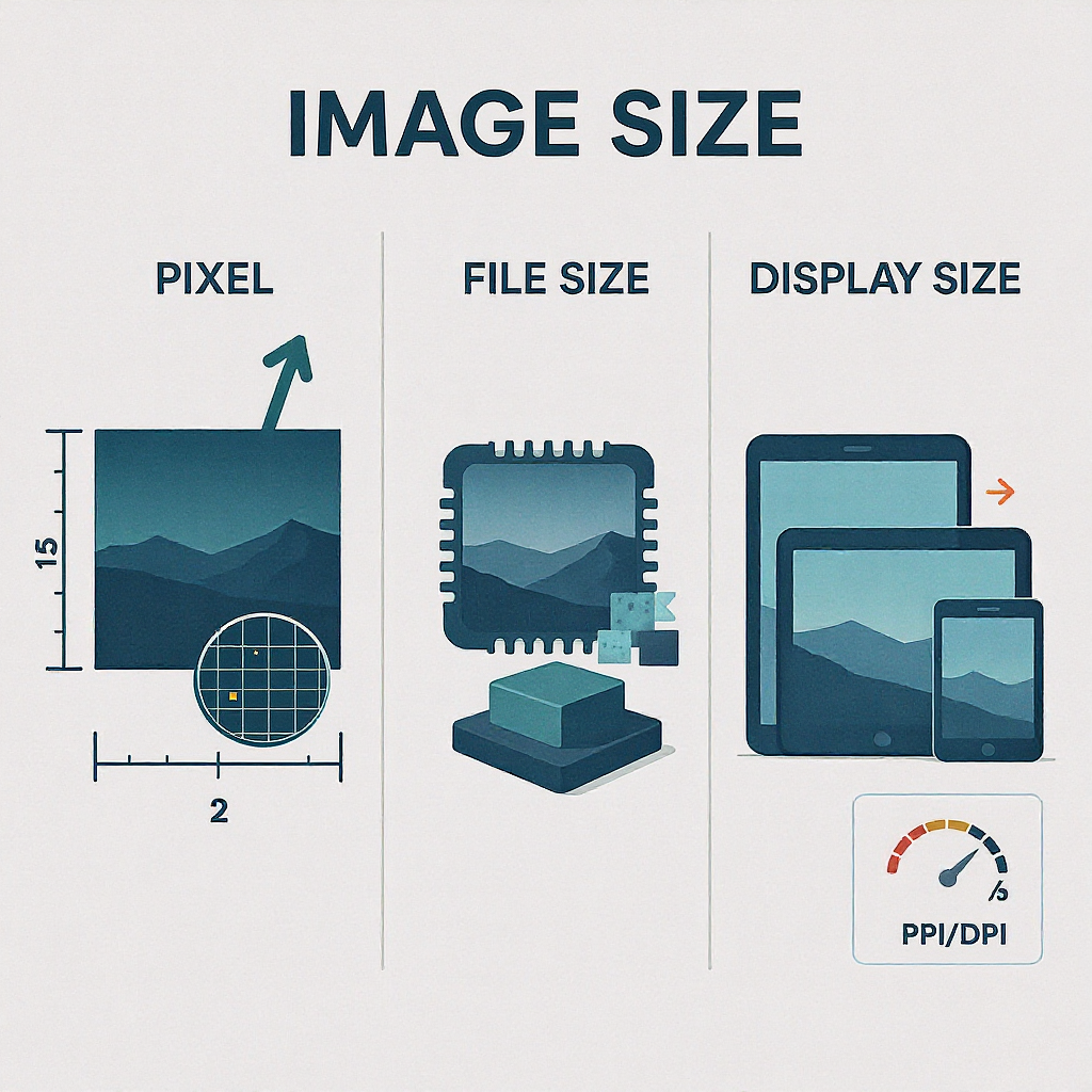
Understanding “image size” is trickier than it sounds because the term can refer to pixel dimensions, file weight, on‑screen size, or print dimensions. This guide explains each meaning clearly, shows quick ways to check image size on common devices and apps, and outlines best practices for web and print. Use it as a reference to diagnose fuzzy images, slow pages, or print issues before they happen.
If you’ve ever asked “what’s the image size of this image,” you might really be asking one of several different questions. Image size can mean pixel dimensions, file size, the on‑screen (rendered) size, or even the physical print size. This guide clarifies the terms, shows you how to check them on any device or app, and helps you choose the right sizes for web and print.
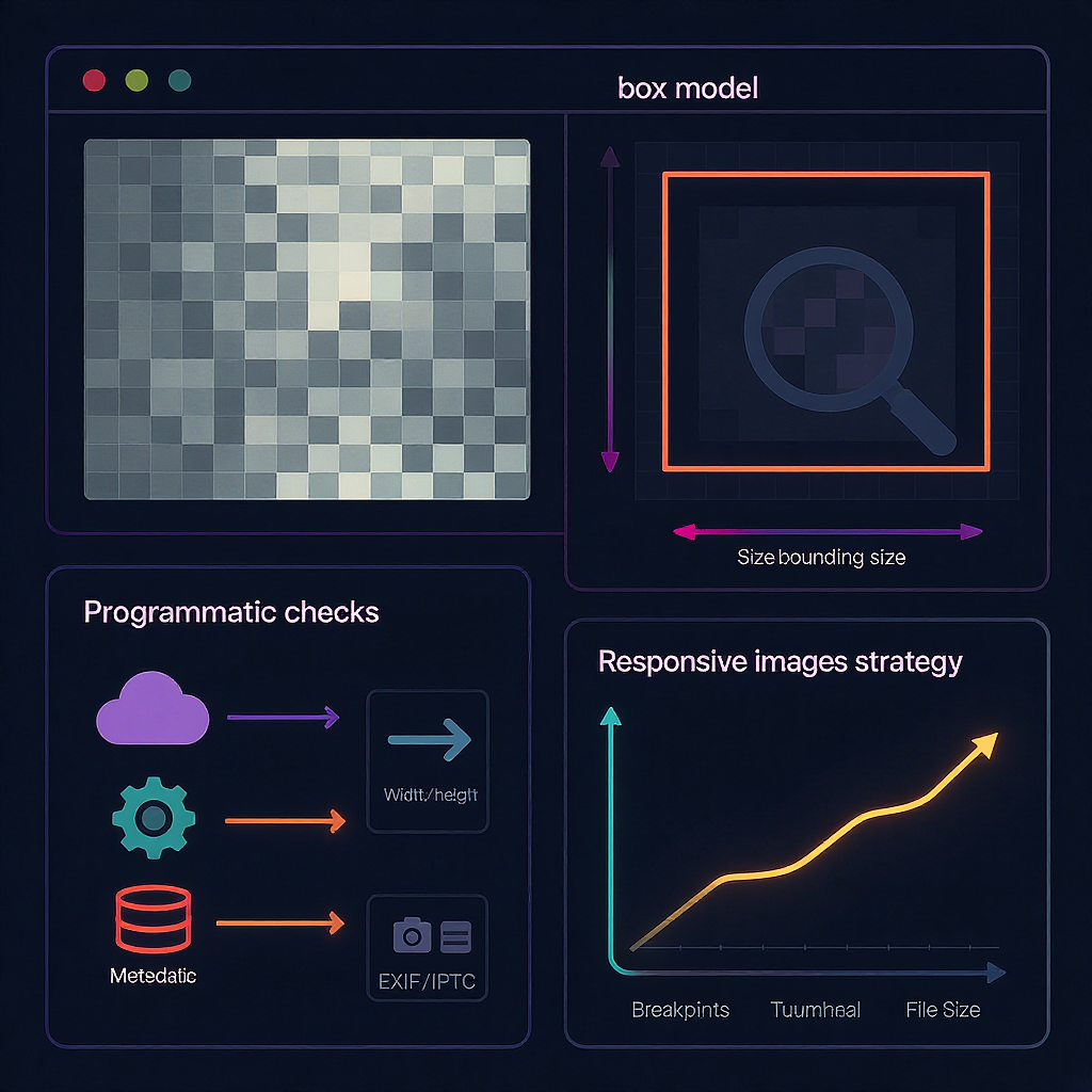
What “image size” really means
Different “sizes” describe different properties. Knowing which one you need avoids confusion and bad quality.
| Term | What it is | Units | Where you see it | Affects |
|---|---|---|---|---|
| Pixel dimensions | Count of pixels wide × tall | px | Editors, OS details, browser “natural size” | Clarity when scaled; cropping; responsive choices |
| File size | How heavy the file is | KB/MB | Finder/Explorer, downloads, network | Load speed, bandwidth |
| Rendered (display) size | How big it appears on screen | CSS px | Browser layout/DevTools | Layout, sharpness on HiDPI |
| Print size | Physical size when printed | in/cm at DPI | Print dialogs, metadata | Print sharpness |
| Aspect ratio | Width:height proportion | ratio (e.g., 16:9) | Cropping, responsive images | Framing, layout consistency |
| PPI/DPI | Pixels (or dots) per inch | ppi/dpi | Metadata, printer settings | Print scaling; not web sharpness |
Key points:
- Pixel dimensions define how much detail is available.
- File size is mostly about compression and format, not sharpness.
- Display size is controlled by CSS/layout and device pixel ratio.
- Print size is pixels mapped to inches/cm at a chosen DPI.
Quick checks on any device
- Windows
- File Explorer: right‑click > Properties > Details to see Dimensions and Size.
- Photos app: open image > … (More) > File info.
- macOS
- Finder: select file > Command+I (Get Info) for pixel dimensions and file size.
- Preview: Tools > Show Inspector (Command+I) > More Info (i) > General/Exif tabs.
- iPhone/iPad (iOS/iPadOS)
- Photos: open photo > tap the ⓘ (Info) button for file size and resolution (on recent iOS).
- Share sheet to Files: long‑press > Info for details.
- Android
- Google Photos: swipe up or tap ⋮ > Info (i) for resolution and file size.
- Files app: open details; some galleries show resolution in info/metadata.
- Google Photos/Drive (web)
- Google Photos: open image > ⓘ (Details) panel shows dimensions and file size.
- Google Drive: right‑click > View details.
In popular apps: where to find dimensions and what they mean
- Photoshop
- Image > Image Size: shows Pixel Dimensions and Document Size (inches/cm at a DPI).
- Changing pixel dimensions resamples the image. Changing DPI without resampling only affects print size.
- macOS Preview
- Tools > Adjust Size: shows pixel dimensions and print dimensions/DPI.
- GIMP
- Image > Scale Image: “Image Size” (pixels) vs “X/Y resolution” (print DPI).
- Figma
- Select an image/frame: right panel shows its size (CSS pixels). Export panel shows export sizes (1x/2x/3x) and formats.
- Canva
- File > Resize (Pro) or Download > Size slider: dimensions in pixels; exports at selected resolution.
Tip: “PPI/DPI” fields in editors are for print. They do not change how sharp the image appears in a browser unless you resample the pixels.
In your browser: intrinsic vs rendered size
- Quick check
- Right‑click image > Open image in new tab. Most browsers show the intrinsic pixel dimensions in the tab title or status.
- DevTools (Chrome/Edge/Firefox)
- Inspect the `
` element. The tooltip and sidebar show natural (intrinsic) size and rendered size.
- Compare:
- naturalWidth/naturalHeight: actual pixels in the file
- CSS width/height or layout box: displayed size on the page
- Device Pixel Ratio (DPR): `window.devicePixelRatio` (e.g., 2 on Retina). On high‑DPI screens, an image rendered at 300 CSS px may look sharper if its intrinsic width is 600 px (2x).
Responsive images and srcset/sizes:
- If an `
` has srcset and sizes, the browser picks the best candidate based on layout width and DPR.
- Example:

Programmatic methods
- JavaScript (in the browser)
const img = document.querySelector('img');
console.log('Intrinsic:', img.naturalWidth, 'x', img.naturalHeight);
console.log('Rendered:', img.getBoundingClientRect().width, 'x', img.getBoundingClientRect().height);
console.log('DPR:', window.devicePixelRatio);
// Effective pixel density relative to CSS size:
const effectiveScale = img.naturalWidth / img.getBoundingClientRect().width;
console.log('Effective scale:', effectiveScale.toFixed(2), 'x');- Command line
- ImageMagick
identify -format "%f: %w x %h | %b | %m\n" image.jpgOutputs filename, pixel dimensions, file size, and format.
exiftool -ImageWidth -ImageHeight -FileSize -MIMEType -Orientation -XResolution -YResolution -ResolutionUnit image.jpgUseful for metadata, orientation, and print DPI.
- Python (Pillow)
from PIL import Image, ExifTags
im = Image.open("image.jpg")
print("Pixels:", im.width, "x", im.height)
print("Info:", im.info)  # may include dpi, icc_profile
print("DPI:", im.info.get("dpi"))
exif = im.getexif()
orientation = exif.get(0x0112)  # EXIF Orientation
print("Orientation:", orientation)
Batch a folder with Python:
import os
from PIL import Image
for root, _, files in os.walk("images"):
  for f in files:
    p = os.path.join(root, f)
    try:
      with Image.open(p) as im:
        print(f"{p}: {im.width}x{im.height} px")
    except Exception as e:
      print(f"Skip {p}: {e}")
Reading metadata (EXIF/IPTC) and orientation
- Common fields
- ImageWidth/ImageHeight or ExifImageWidth/Height: intrinsic pixel dimensions.
- Orientation: how the image should be rotated on display.
- XResolution/YResolution + ResolutionUnit: print DPI.
- IPTC/XMP: captions, keywords (not size but often present).
- Orientation pitfalls
- Some cameras store a tall photo as “rotated” via an orientation flag (e.g., 6 = 90° CW). Software may show it upright without altering pixels.
- When exporting or editing, some tools “bake in” rotation and reset Orientation to 1.
- Metadata stripping
- Social networks and optimizers often strip or rewrite metadata, which can remove DPI or orientation info.
Use ExifTool to inspect:
exiftool -Orientation -ImageWidth -ImageHeight -ExifImageWidth -ExifImageHeight file.jpgChoosing the right dimensions for the web
A few sensible starting points (adjust to your layout and audience devices):
| Use case | Recommended CSS width | Provide assets | Notes |
|---|---|---|---|
| Hero/banner | 1200–1600 px | 1x + 2x (e.g., 1600 and 3200 px) | Wide viewports benefit from 1600–1920 px |
| Main content images | 680–960 px | 1x + 2x (e.g., 800 and 1600 px) | Match your content column width |
| Thumbnails/cards | 150–400 px | 1x + 2x (e.g., 300 and 600 px) | Keep aspect ratio consistent |
| Full‑bleed backgrounds | 1920 px | Optionally 2560–2880 for 2x | Use cover; compress aggressively |
Retina/HiDPI strategy:
- Serve 2x/3x sources via srcset or vector formats (SVG) for crisp UI.
- Always constrain CSS width to your layout; don’t dump enormous images into small slots.
Balancing quality and file size
- Choose the right format
- JPEG/JPG: photos and gradients; lossy; aim quality 70–85.
- PNG: flat graphics, transparency, screenshots; lossless; compress with zopflipng/oxipng.
- WebP: great default for web; supports lossy/lossless + alpha.
- AVIF: best compression for photos; slower to encode; provide fallbacks.
- SVG: vector logos/icons; razor sharp at any size.
- Target weights (guidelines, not laws)
- Thumbnails: 10–50 KB
- Content images: 50–200 KB
- Heroes/backgrounds: 150–500 KB (try under ~300 KB when possible)
- Compression tips
- Resize to the largest needed pixel dimension before exporting.
- Prefer modern codecs (WebP/AVIF) for photos.
- Tune chroma subsampling (4:2:0) and quality for JPEGs.
- Strip unnecessary metadata unless you need it.
- Helpful tools
- Squoosh, ImageOptim, TinyPNG/TinyJPG, PNGQuant, MozJPEG, libvips, Sharp, Oxipng/Zopfli.
Converting pixels to print size
- The math
- inches = pixels ÷ DPI
- pixels = inches × DPI
- Typical DPI for quality prints
- 300 DPI for high‑quality photos
- 240 DPI often acceptable for large prints viewed at distance
- Examples
- 2400 × 3000 px at 300 DPI → 8 × 10 inches
- 1800 × 1200 px at 300 DPI → 6 × 4 inches
- Common print formats and required pixels (at 300 DPI)
- 4 × 6 in → 1200 × 1800 px
- 5 × 7 in → 1500 × 2100 px
- 8 × 10 in → 2400 × 3000 px
- A4 (8.27 × 11.69 in) → ≈ 2481 × 3507 px
Remember: Changing the DPI metadata without resampling does not add detail; it only alters how large the printer maps your existing pixels.
FAQs and troubleshooting
- Why do file size and pixel size not match expectations?
- Compression, format, and content complexity drive file size. A 4000 × 3000 PNG of a flat graphic could be smaller than a 2000 × 1500 noisy JPEG.
- My image looks blurry on a Retina display. Why?
- You’re likely displaying a 1x asset at 2x CSS size. Provide a 2x (or 3x) intrinsic image via srcset and constrain layout width.
- The website says my upload is “too large.” What does it mean?
- It might limit file size (MB), pixel dimensions, or both. Resize before upload and compress efficiently.
- Social media changed my image size/crop. Is that normal?
- Yes. Platforms recompress and auto‑crop to their aspect ratios. Check their current guidelines and upload at recommended dimensions.
- My photo appears rotated incorrectly in some apps.
- The EXIF Orientation flag may be ignored. Rotate and export to bake in the correct orientation (Orientation=1).
- How do I check “what’s the image size of this image” on a web page?
- Inspect the `
` in DevTools to see naturalWidth/Height and CSS size. Right‑click > Open image in new tab to view intrinsic dimensions.
- Does 72 DPI matter for web?
- No. Browsers ignore DPI for display. Only pixel dimensions and CSS/layout matter on the web.
Quick checklist
- Identify which “size” you need: pixels, file weight, rendered CSS size, or print size.
- Check intrinsic pixels via OS/app info or DevTools naturalWidth/Height.
- For web, deliver right‑sized assets with srcset and compress with WebP/AVIF when possible.
- For print, ensure you have enough pixels for your target inches at 300 DPI.
Summary
“Image size” can mean pixels, bytes, CSS rendering, or print dimensions, and each affects quality and performance differently. Check the intrinsic pixels first, then match delivery to your layout and device density, compressing appropriately. For print, calculate inches from pixels at your chosen DPI and avoid relying on DPI metadata alone.