Regular Photo Size Standards for Print, Web, and Social Medi
Learn standard photo sizes for print, web, and social media, including aspect ratios and best practices to optimize quality across different platforms.
Understanding Regular Photo Size
When people ask "what's the regular photo size", they usually mean the most commonly accepted dimensions for printing, sharing, or displaying images. The term is flexible because the “regular” size changes depending on the purpose and medium:
- Print photography: Measured in inches; based on paper standards and common frame sizes.
- Digital displays: Measured in pixels; dependent on device resolution and screen density.
- Social media: Determined by platform-specific image guidelines for optimal visibility.
In short, the regular photo size means matching the standard expectation for your chosen medium—be it a wallet-size print, a blog header, or an Instagram square.

---
Standard Photo Sizes for Print
Common Print Dimensions
Physical prints are defined in inches. These are the industry’s most familiar sizes:
- 2×3 inches – wallet-size photos, school portrait prints.
- 4×6 inches – the most typical "snapshot" size from consumer cameras.
- 5×7 inches – slightly larger, common for portrait gifts and tabletop frames.
- 8×10 inches – favored for framing professional photographic work.
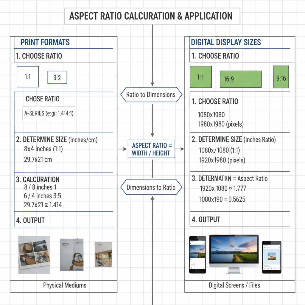
Aspect Ratios in Print
Aspect ratio defines the proportional relationship between width and height:
- 2:3 ratio – common for camera sensors (e.g., 4×6 prints).
- 4:5 ratio – used in 8×10 prints.
- 1:1 – square format, popular on Instagram.
Maintaining the correct aspect ratio ensures the composition remains accurate when resizing.
---
Digital Photo Dimensions for Screens
On screens—whether monitors, TVs, or mobile—image measurements are in pixels:
- Resolution: The total pixel count, such as 1920×1080.
- DPI/PPI: Dots per inch (print) or pixels per inch (digital), affecting clarity for each medium.
Modern consumer screens average 72–120 PPI, but retina and high-density displays offer 300+ PPI for sharper visuals.
---
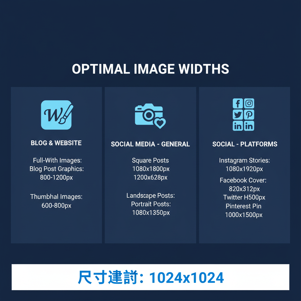
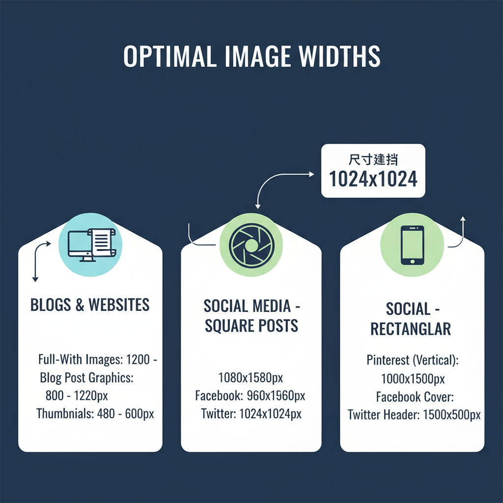
Optimal Sizes for Web and Blogs
Suggested Widths for Web Content
- In-article images: 800–1200px wide for clear display on desktops.
- Full-width banners: 1920px wide, often used for large headers.
- Thumbnails: 150–300px depending on layout.
With responsive design, images adapt to different devices. HTML’s `srcset` and CSS media queries help deliver scaled images efficiently.
---
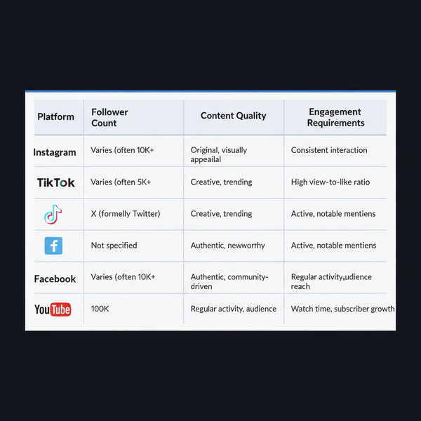
Social Media Photo Size Standards
Every platform has unique recommended sizes. Using the right dimensions prevents poor cropping or resolution loss.
| Platform | Profile Photo | Cover / Header | Post Image |
|---|---|---|---|
| 320×320 px | N/A | 1080×1080 px (square) | |
| 180×180 px | 820×312 px | 1200×630 px | |
| 400×400 px | 1500×500 px | 1024×512 px | |
| N/A | N/A | 1000×1500 px |
Optimizing dimensions per platform improves sharpness and increases engagement.
---
Tips for Choosing Sizes by Purpose
- Printing: Match printer DPI; use ~300 DPI for sharp results.
- Framing: Select your frame before printing to avoid awkward cropping.
- Posting Online: Follow platform recommendations; compress without sacrificing quality.
- Email Attachments: Keep under 1MB for quicker loading and delivery.
---
Common Mistakes When Resizing Photos
Avoid these pitfalls:
- Stretching images: Leads to unnatural distortion.
- Improper cropping: Can remove important subject elements.
- Excessive resolution reduction: Causes blurriness.
- Ignoring aspect ratio: Results in irregular framing or poor layout compatibility.
---
How Resolution Impacts Clarity
DPI vs. PPI
- DPI (Dots Per Inch): Print measurement—higher DPI yields finer print detail.
- PPI (Pixels Per Inch): Screen measurement—defines sharpness in display.
A 72 PPI image might look fine onscreen but will likely be blurry when enlarged for print unless its pixel dimensions can support the DPI requirement.
---
Recommended Tools for Resizing and Optimizing Images
To prepare your photos for any output, use:
- Adobe Photoshop – granular control over size and resolution.
- GIMP – a free alternative with strong editing capabilities.
- Canva – user-friendly online designer with preset templates.
- ImageMagick – command-line utility for batch processing.
- TinyPNG / JPEGmini – effective compression for web images without major quality loss.
---
Quick Reference Chart
| Use Case | Size (inches) | Pixels (at 300 DPI) | Aspect Ratio |
|---|---|---|---|
| Wallet Photo | 2×3 | 600×900 | 2:3 |
| Standard Print | 4×6 | 1200×1800 | 2:3 |
| Portrait Frame | 5×7 | 1500×2100 | 5:7 |
| Large Frame | 8×10 | 2400×3000 | 4:5 |
| Blog Content | N/A | 1200×800 | 3:2 |
| Instagram Feed | N/A | 1080×1080 | 1:1 |
---
Conclusion
The answer to "what's the regular photo size" changes with your goal—print, web, or social media. For print, work in inches and match the DPI requirement. For digital, pixels and platform specifications are key.
By knowing aspect ratios, resolution standards, and output needs, your photos will look clear and correctly proportioned across all media.
Pro tip: Decide your target medium before capturing or editing photos. This foresight ensures beautiful results, whether hanging in your living room or featured on your online profile.
Ready to perfect your images? Apply these sizing strategies today for professional, platform-ready photos every time.