Why Are Some Instagram Notes White: Color Meanings
Learn why some Instagram Notes appear white, how light mode, unread styling, and UI experiments affect colors, and tips for troubleshooting display issues.

If you’ve ever asked yourself “why are some instagram notes white,” you’re seeing how Instagram balances legibility, theme settings, and ongoing UI experiments. This guide explains what Instagram Notes are, why color variations exist, and how to troubleshoot color display quirks—so you can focus on using Notes to spark quick conversations.
Why Are Some Instagram Notes White: Color Meanings and UI Quirks
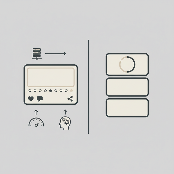
Instagram Notes are tiny, lightweight status messages that sit at the top of your Direct Message (DM) inbox. If you’ve ever wondered why some Instagram Notes look white while others have colored backgrounds or gradients, you’re not alone. The short answer: it mostly comes down to theme (light/dark mode), read/unread status styling, and Instagram’s ongoing UI experiments and A/B tests. This guide breaks down how Notes work, what the visuals mean, and how to troubleshoot when the colors don’t look right.
Introduction to the Instagram Notes Feature
Instagram launched Notes to give users a quick, low-pressure way to share short thoughts, updates, or prompts without committing to a full post or Story. Think of Notes as a fleeting, text-only headline above your DM threads—perfect for asking a question, dropping a joke, or nudging friends to reply.
Notes are intentionally minimal: they aren’t designed to be permanent or heavily styled, and they disappear after 24 hours. Because they live inside your inbox, they are meant to spark quick conversations.
Key capabilities at a glance
- Short text-only messages (up to 60 characters)
- Visible for 24 hours
- Audience controls: mutual followers or Close Friends
- Replies arrive as direct messages, keeping conversations private
What Instagram Notes Are and How They Work
Notes are short messages (up to 60 characters) that appear above your DM list. You choose who can see your Note—followers you follow back or Close Friends—and it remains visible for 24 hours, similar to Stories.
- Where they appear: At the top of your inbox, above recent conversations.
- Who sees them: Mutual followers or Close Friends, depending on your setting.
- How long they last: 24 hours.
- Interactions: People can reply, and replies land as direct messages.
How to post a Note
- Open Instagram and go to the DM tab.
- At the top, tap your profile icon labeled “Leave a note.”
- Type up to 60 characters.
- Choose “Followers you follow back” or “Close Friends.”
- Tap “Share.”
Visual Elements in Instagram Notes
When you look at Notes in your inbox, you’ll see a simple combination of visual elements:
- Profile picture: The user’s avatar appears inside a small circle or bubble.
- Text: A short message overlaid near or atop the avatar bubble.
- Background/bubble: The micro-bubble or pill behind the text, which may be white, off-white, gray, or occasionally colored/gradient depending on your theme and Instagram’s UI experiments.
- Indicators: Small status markers like a green dot (active status) or subtle outlines that denote unread items for some users.
Instagram keeps this design purposely minimal to prioritize quick reading and replying.
Why Are Some Instagram Notes White?
If you’re asking “why are some instagram notes white,” the most common explanations are:
- Default styling in light mode: In light theme, Notes often render with a white or near-white background behind the text for contrast and readability.
- Unread vs. read styling: Some builds style unread notes with brighter, higher-contrast backgrounds (white or off-white). Once viewed or scrolled past, the background can appear dimmer or grayer.
- Non-experimental account: Instagram regularly A/B tests colored or gradient Notes. If your account isn’t in an experimental cohort, you’re more likely to see plain white Notes.
Crucially, a white Note does not necessarily indicate anything about the note’s content or the user’s relationship to you; it’s mostly a theme and design clarity choice. Instagram prioritizes legibility, and white (or light) backgrounds are the easiest way to make short text pop in the inbox.
The Role of DM Status and Activity in Note Color
While Notes are independent of DM threads, a few inbox status cues can influence the way Notes look:
- Unread DM highlighting: If Instagram detects lots of unread activity, the UI can emphasize Note visibility with higher contrast (often white or bright backgrounds in light mode).
- Active status indicator: The green dot indicates a user is active, but it doesn’t generally change Note color—it’s an adjacency cue near their avatar.
- Interaction state: After you tap a Note to reply, some users report the bubble appears subdued (grayer or lower contrast), which can make previously “white” notes look less bright.
None of these statuses definitively change color across all accounts; Instagram tests multiple visual variations. However, these states can nudge the UI toward more or less contrast in your inbox.
Differences Between White Notes and Colored Notes
Instagram has experimented with colored and gradient Note backgrounds. Here’s what typically distinguishes white vs. colored Notes:
- White or off-white notes:
- Default look in light theme.
- Higher legibility, especially for short text on busy inbox screens.
- Common on accounts not included in UI experiments.
- May appear brighter if the Note is considered “new” or “unread.”
- Colored or gradient notes:
- Often part of A/B tests aimed at visual differentiation or engagement.
- Sometimes tied to special features (e.g., Notes with music, region-specific trials), though color itself is not a confirmed feature flag.
- More visually prominent, intended to catch your eye.
- May appear different depending on theme and device.
Important reminder: There is no universal, official color meaning published by Instagram for Notes. Colors are primarily design choices, not signals of content category or relationship type.
How Dark Mode and Light Mode Affect Instagram Notes Appearance
Theme has a major impact on how Notes appear:
- Light mode:
- Notes typically use white or off-white backgrounds.
- Text is usually dark gray or black for maximum contrast.
- If you see colored notes, they’ll be vibrant and stand out.
- Dark mode:
- Notes often appear as dark gray or near-black backgrounds.
- White notes can look more muted or medium-gray due to dark UI palettes.
- Colored or gradient notes may desaturate slightly to avoid glare.
If you’re asking “why are some instagram notes white” and you’re in dark mode, you might be seeing high-contrast elements that still render light within a dark UI, or you’re in a test group where color handling differs between themes.
Impact of Instagram UI Updates and A/B Testing on Note Colors
Instagram frequently rolls out UI updates in waves and runs A/B tests to measure engagement. This means your friend’s Notes screen might look different from yours, even if you’re using the same app version.
- A/B testing: Some users get color or gradient backgrounds to test readability and conversation rates.
- Regional rollouts: New styles may appear in certain countries or regions first.
- Feature flags: Notes with added capabilities (e.g., music) can be bundled with visual tweaks during testing.
- Accessibility tuning: Instagram adjusts contrast levels and adaptive colors based on device settings and readability targets.
Because of these variables, “white vs. colored” is rarely a universal rule. It’s better understood as a design variation that evolves over time.
Troubleshooting Color Display Issues in Instagram Notes
If your Notes look odd, washed out, or you’re expecting colored notes that others see, try these fixes:
- Update the app:
- Go to the App Store or Google Play and update Instagram to the latest version.
- New builds often standardize visuals or fix color rendering bugs.
- Toggle dark/light mode:
- Switch your device theme to see how Notes look in the opposite mode.
- On iOS: Settings > Display & Brightness > Appearance.
- On Android: Settings > Display > Dark theme.
- Check accessibility settings:
- High contrast text or color correction can change UI hues.
- iOS: Settings > Accessibility > Display & Text Size (increase contrast, color filters).
- Android: Settings > Accessibility (color correction, high contrast text).
- Clear cache and restart:
- Android: Settings > Apps > Instagram > Storage > Clear Cache.
- iOS: No cache button; instead, force close and relaunch the app.
- Reinstall Instagram:
- Back up login details.
- Uninstall the app and reinstall to refresh assets and experiments.
- Opt out/in of beta:
- If you’re in a Play Store beta, leave beta to restore stable visuals.
- Conversely, joining beta may expose you to new color tests.
- Test another account:
- Log in to a different account on the same device to see if colors differ.
- If one account shows colored notes and the other shows white, you’re seeing A/B test variations.
- Disable battery/data saver:
- Power-saving modes can affect animations and sometimes visual assets.
- Turn off data saver and battery saver to test.
- Watch for regional rollouts:
- If friends in other regions see colored notes, you may be in a delayed rollout zone.

Quick Reference: White vs. Colored Notes
| Aspect | White Notes | Colored/Gradient Notes |
|---|---|---|
| Typical Cause | Default light-mode styling; non-experimental UI | A/B tests; experimental UI; occasional feature-specific trials |
| Theme Impact | Bright white or off-white in light mode; muted in dark mode | Vibrant in light mode; desaturated in dark mode |
| Status Effects | May appear brighter when “new” or unread | Usually not tied to status; purely visual emphasis |
| Readability | High contrast for text legibility | Attention-grabbing but can reduce text contrast |
| Availability | Common across most accounts | Varies by user, region, and app version |
Best Practices for Using Instagram Notes Effectively
Color variations aside, Notes are most effective when you use them strategically:
- Keep it short and specific: Ask a clear question or share a concise update.
- Use Close Friends for targeted prompts: If you want higher response quality, address people who are more likely to engage.
- Pair with timely DM replies: Notes are conversation starters—actively follow up.
- Experiment with timing: Share Notes when your audience is most active (check activity insights if you have a professional account).
- Be consistent: Posting Notes regularly helps train your audience to look for them.
FAQ: Why Are Some Instagram Notes White?
- Do white Notes mean they’re unread?
- Not always. On some accounts, white notes look brighter when new, but there’s no universal rule.
- Are colored Notes only for Close Friends?
- No. Color isn’t reliably tied to audience selection. Green rings indicate Close Friends in Stories, but Notes color is mostly experimental or theme-related.
- Can I force colored Notes?
- You can’t force experiments. Keeping your app updated and joining beta programs may expose you to UI tests, but there’s no guaranteed switch.
- Do white Notes indicate someone is online?
- Online status is typically indicated by a green dot. Note color does not confirm online status.
Conclusion: Interpreting Note Colors Without Overthinking
If you’re wondering “why are some instagram notes white,” the most accurate explanation is that white backgrounds are the default high-contrast style, especially in light mode and on non-experimental builds. Colored or gradient Notes are often part of Instagram’s A/B testing and can vary by account, region, and theme settings. Read/unread styling and active status can subtly influence how bright or subdued Notes look, but there’s no official, universal color meaning to decode.
To get the best experience:
- Keep your app up to date.
- Test light vs. dark mode.
- Be aware of A/B tests—your friends may see different designs.
- Focus on content and timing: use Notes to spark quick, meaningful conversations rather than chasing color variations.
Ultimately, Notes are about connection, not color. Share something concise, timely, and conversational, and the replies will matter far more than whether your note appears white or gradient.
Summary and next steps
- Most white Instagram Notes are a result of light-mode defaults, legibility choices, and non-experimental UI builds.
- Colored or gradient Notes usually indicate A/B testing or visual experiments that vary by account and region.
- Theme, read/unread states, and accessibility settings can subtly affect perceived brightness and contrast.
Try this now: update your Instagram app, toggle light/dark mode to compare Note colors, and post a clear, conversation-starting Note to encourage replies today.