How to Write in Instagram Story for Better Engagement
Learn how to write in Instagram Stories using fonts, colors, placement, and tone to boost engagement, clarity, and brand recognition.

How to Write in Instagram Story for Better Engagement
Instagram Stories are among the most dynamic tools for connecting with followers in a quick, authentic, and visually compelling way. Learning how to write in Instagram Story effectively isn’t just about adding text — it’s about using the platform’s creative features to amplify your brand voice, boost audience engagement, and make your content stand out in a crowded feed.
This guide walks you through essential techniques — from font choices and color contrast to tone alignment and analytics — so your Stories not only look sharp but also capture attention and prompt action.
---
Understanding Instagram Stories Basics and Features
Before optimizing your writing style, you need to understand the tools Instagram provides inside Stories:
- Text Tool: Allows different font styles, sizes, and colors.
- Stickers: Interactive options like polls, questions, countdowns.
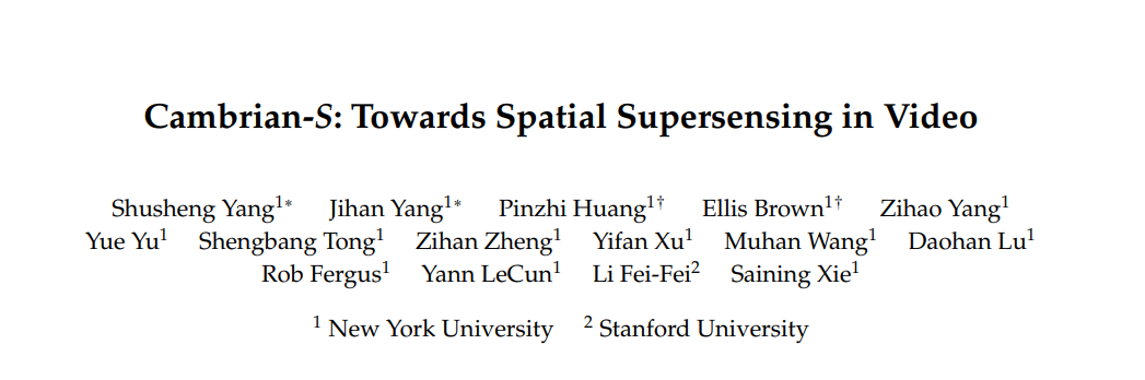
- Fonts: Choices include Classic, Modern, Neon, Typewriter, and Strong.
- Color Picker: Preset palettes plus custom with the eyedropper.
Stories last just 24 hours unless saved to Highlights, making them both urgent and ephemeral. This time limit means your messaging needs to be visually appealing and immediately clear.
---
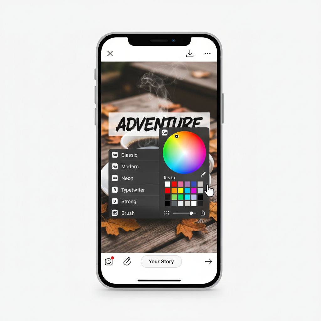
Choosing the Right Font Style and Size
Font selection sets the tone:
- Classic Fonts: Professional and timeless, ideal for announcements.
- Modern Fonts: Clean, minimalist, and great for lifestyle brands.
- Neon/Handwriting Fonts: Playful and casual, perfect for personal updates.
Best Practices
- Keep font size large enough for mobile readability.
- Use no more than two complementing fonts per Story for a consistent look.
---
Picking Text Colors for Contrast and Readability
Color contrast strongly affects legibility. Poor contrast can result in skipped content.
Tips for Better Contrast
- Light text on dark backgrounds, and dark text on light backgrounds.
- Use transparent background highlights for busy photos.
- Incorporate brand colors, but never sacrifice visibility.
---
Strategic Text Placement
Effective text placement helps ensure your message is seen without obstructing key visuals.
Avoid
- Overlapping faces, products, or focal points.
- Aligning text too close to interface elements that may cover it.
Placement Ideas
- Top center for headlines.
- Bottom thirds for calls-to-action like “Swipe Up”.
- Off-center alignment to follow a subject’s gaze for flow.
---
Adding Emphasis with Font Enhancements
Enhancement tools make text stand out:
- Bold for important words.
- Italic for emphasis or quotes.
- Highlight/Background to stress phrases.
Example:
SALE ENDS TONIGHT
USE CODE: STORY20
This conveys urgency at a glance.
---
Incorporating Hashtags, Mentions, and Links Intuitively
Proper use of hashtags and mentions can improve reach:
- Hashtags: Focus on relevant, niche hashtags. Hide small ones with stickers if needed.
- Mentions: Tag collaborators and featured individuals.
- Link Stickers: Include clear instructions like “Tap link sticker” to guide users.
---
Structuring Captions for Clarity
Overly long text blocks can lose attention quickly. Break content into small, focused pieces.
Formatting Techniques
- One main idea per slide.
- Line breaks for readability.
- Maintain consistent brand tone.
---
Matching Tone and Style with Your Brand Voice
Consistency strengthens recognition:
- Casual brands: Conversational, maybe with emojis or slang.
- Corporate: Direct and polished language.
- Creative: Distinctive layouts and innovative typography.
The goal is for followers to recognize your brand voice instantly.
---
Using Creative Elements Without Overwhelming
Emojis, GIFs, and animations can bring a Story to life — if used with restraint.
Do:
- Add a single, relevant GIF for emphasis.
- Pair emojis with corresponding words.
Avoid:
- Overloading with unrelated icons.
- Too much movement that distracts from the message.

---
Testing Different Text Variations
Test and tweak to discover what connects:
- Try different headline styles.
- Vary color schemes.
- Compare short vs. micro-story formats.
Check engagement metrics to find what works best.
---
Analyzing Story Insights
Instagram Insights can guide your strategy:
| Metric | What It Tells You |
|---|---|
| Impressions | Total number of times your Story was viewed |
| Reach | Unique accounts that viewed your Story |
| Forward Taps | Indicates content may be too lengthy or unengaging |
| Back Taps | Signals strong interest; viewers re-read content |
| Exits | Points where viewers dropped off |
Use this data to adjust future Story copy and design.
---
Accessibility in Instagram Story Text
Accessible content welcomes a wider audience:
- Readable Fonts: Avoid overly ornate designs for main text.
- Color Contrast: Important for visibility in varying light.
- Alt Text & Descriptions: Describe visuals in captions if necessary.
- Ample Size: Prevent eye strain.
Improving accessibility can increase both reach and viewer satisfaction.
---
Conclusion and Next Steps
Mastering how to write in Instagram Story content blends creative design with strategic messaging. From font choice and placement to analytics, each element shapes engagement. Start experimenting today: test variations, review Insights, and adjust until you find the sweet spot for your audience.
Ready to supercharge your Instagram presence? Apply these techniques in your next Story, track the results, and keep refining for maximum impact.